Your online store is probably worse than you think
Last updated: 21 April 2026.
We check out hundreds of new online stores every week. To be blunt, most of them look bad — or at best, just okay. The design doesn’t make sense, the interface is confusing, and overall… it just doesn’t look good.
That results in a poor user experience and no sales, even if you're selling great products from great brands.

Most common issues we keep seeing lately
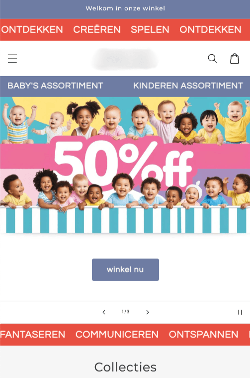
No proper hero section – Many stores lack a clean, clear hero section on their homepage. You need a nice image or video, a clear headline, a call to action, and a button. Also: hero images with text baked into the image almost always look unprofessional.
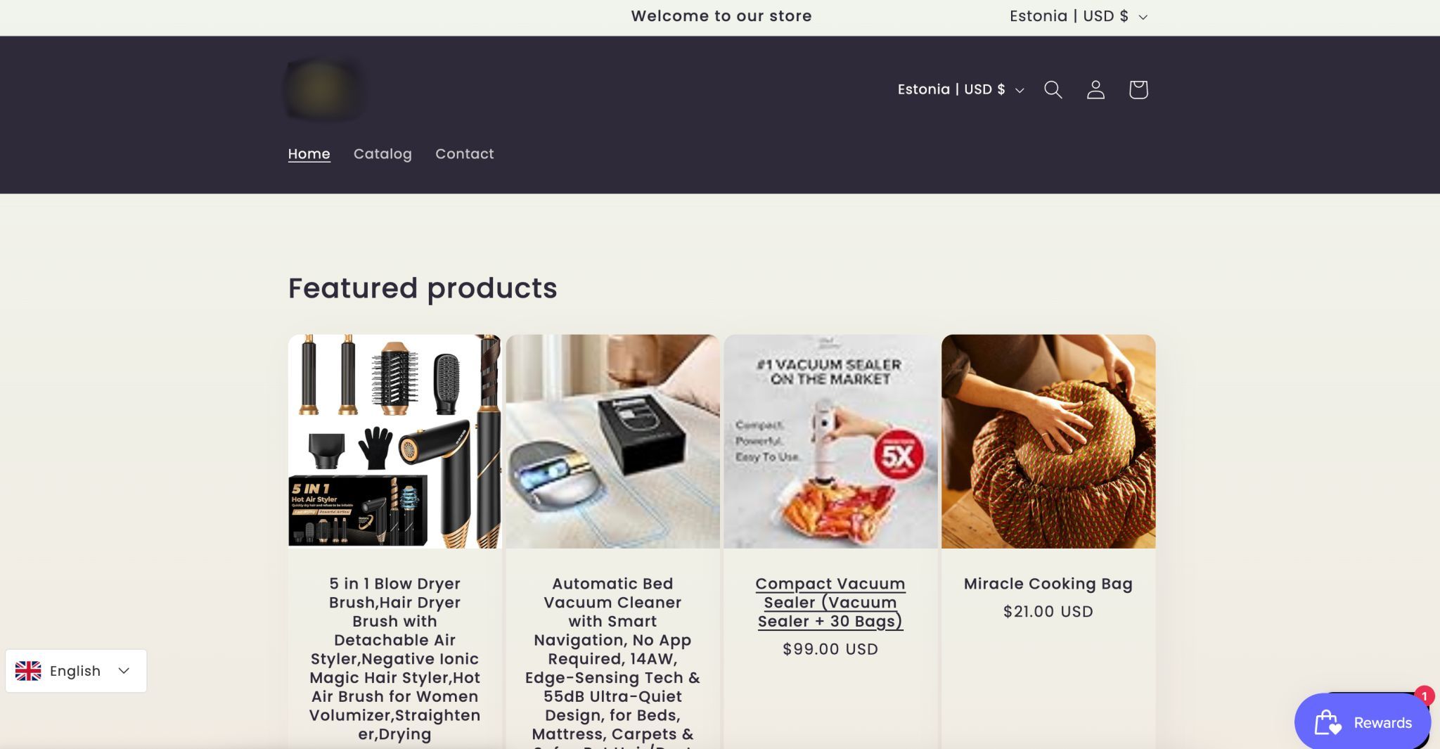
Headers just keep growing. But they really shouldn’t take up more than 25 to 30 percent of the screen, on desktop or mobile. If the header is too big, it pushes hero section, products and buttons out of view and slows people down. On mobile, it’s even worse because space is limited. The goal is clarity and speed. Shoppers should instantly see what’s being sold and what to do next.

Way too much text – Visitors come to browse and shop, not to read an essay. Keep things simple and skimmable.
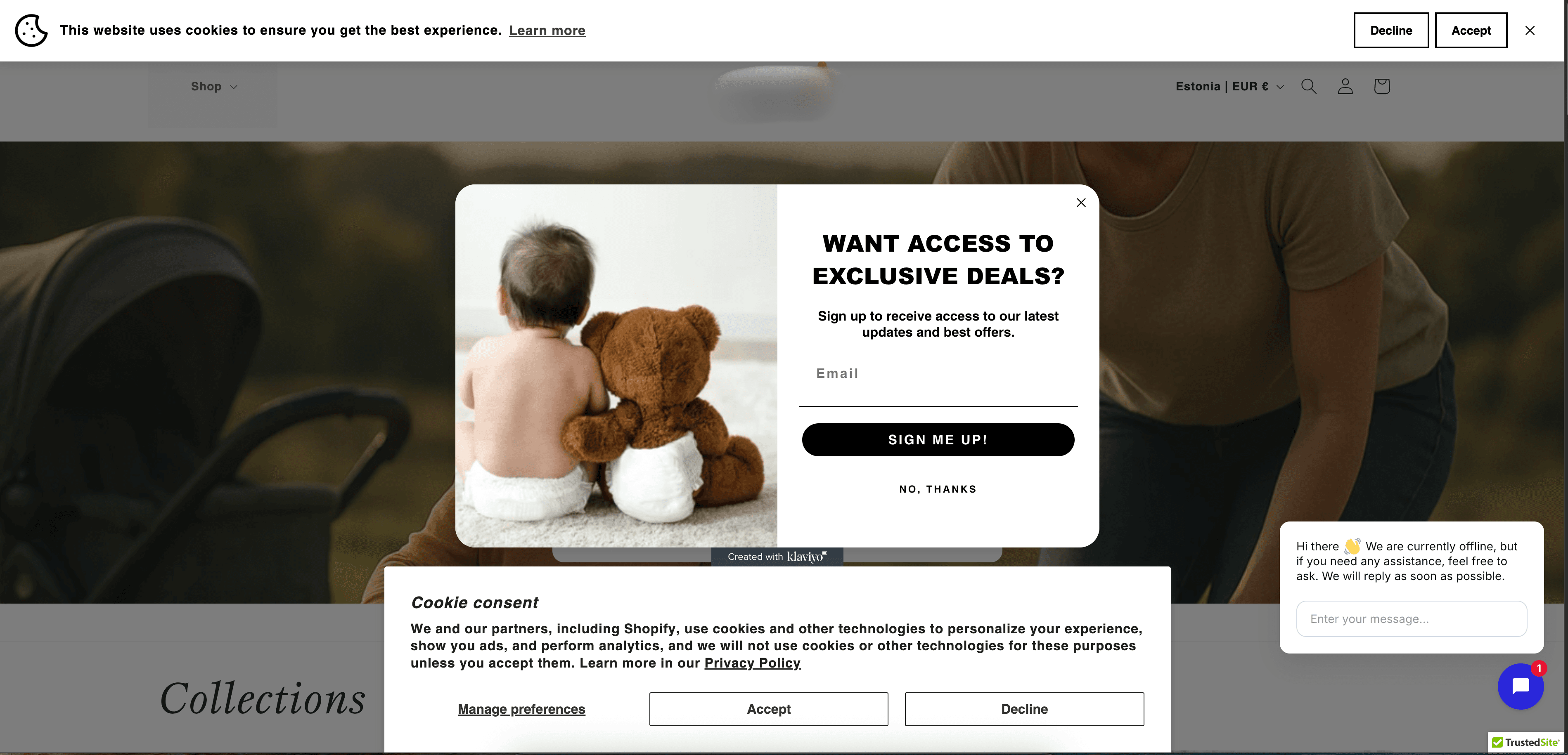
Too much going on right away – Cookie banners (sometimes two!), popups asking for emails, live chat with blinking messages and moving banners... all hitting the visitor in the first second. It's overwhelming. Guide your users toward one action instead.
No clear niche or messaging – Many stores fail to communicate what the store is about and who it’s for. If people don’t instantly “get it,” they leave.
Bad mobile usability – Most merchants build their site on desktop and forget to check how it looks on mobile. But the majority of visitors come from mobile — so test your site there first.
So what should you do?
Ask friends, family or colleagues to use your store and try placing an order, especially on mobile. Then ask them for honest feedback. If possible, sit next to them while they browse, but don’t guide them.
Share your store in local ecom or marketing Facebook groups or forums and ask for feedback. You’ll likely get useful advice and maybe even a few orders. You’ll also get some useless feedback.

Take screenshots of your store and ask your favorite AI tool (like ChatGPT or Claude) to act as a UI/UX and conversion expert. See what it suggests.
If you already have traffic, check Google Analytics or similar tools to understand how users interact with your site. Look at which pages they bounce from, how far they get in the funnel, and how many make it to cart and checkout. If you're unsure how to interpret the data, or don’t even know what to look for, ask ChatGPT. You can describe what you're seeing or share data from your analytics tool, and it can help make sense of it.
If you already have some orders, reach out to those customers and ask about their experience. Their feedback is gold.
More advanced: Use tools like Hotjar or Posthog to record visitor sessions and see how people actually interact with your store. Watching real users browse is incredibly eye-opening, and both tools offer solid free plans.
In conclusion: Your store doesn’t need to be perfect. But if you start driving traffic to a store that looks bad or doesn’t work well, you’re just wasting money — because no one will convert. Fix the basics first.
