Recently, a brand asked me for advice on their product imagery. They’re planning a photoshoot to revamp their product images, which is fantastic! I’m happy to share some insights to help them out.
Why White Background Product Images Are a Good Start
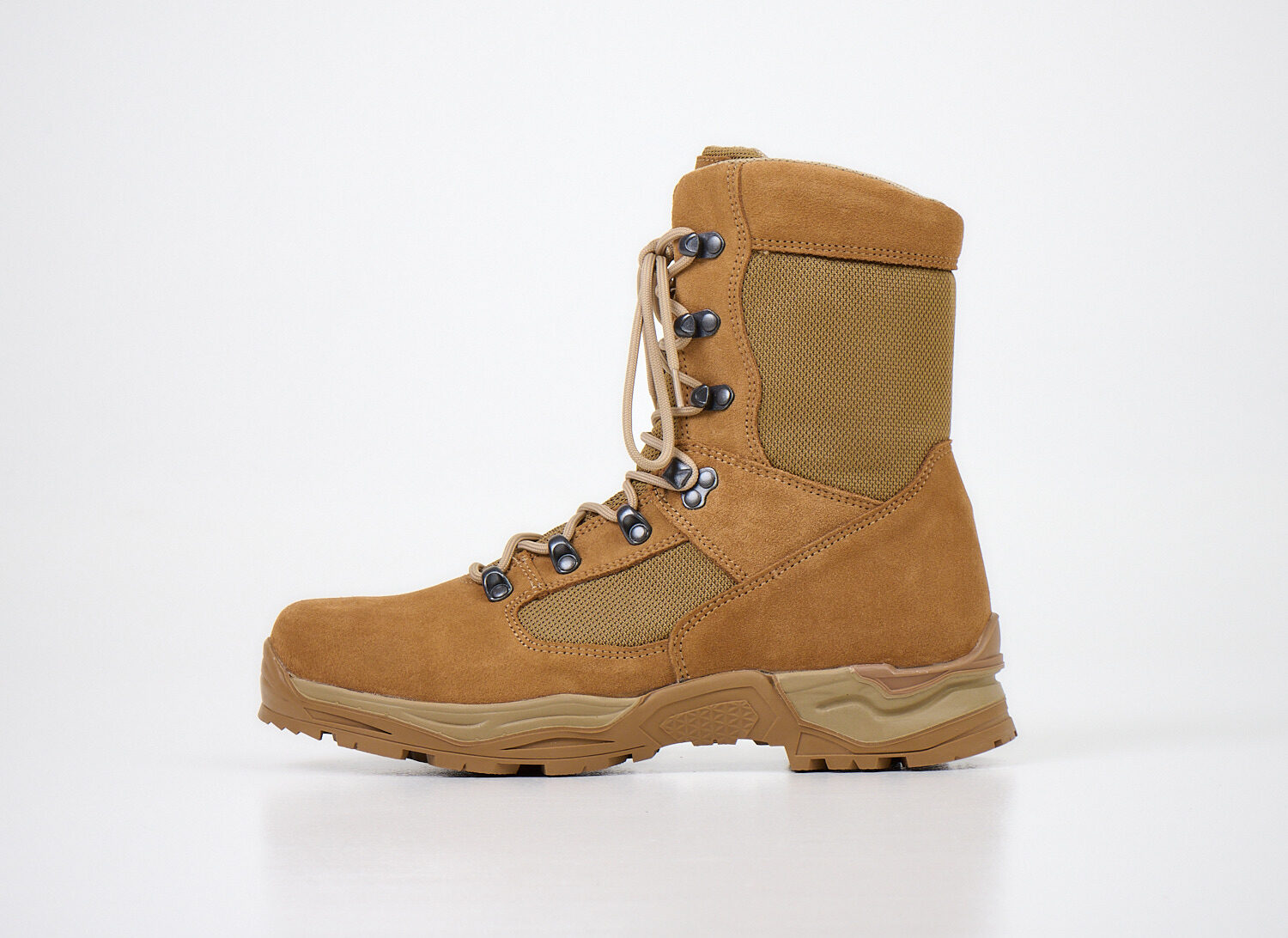
White background product images are a great place to start for a few reasons, and they’re often considered the industry standard in ecommerce:
- Clean and professional look: A white background gives your products a polished, high-quality feel.
- Focus on the product: With no distractions, your product takes center stage, allowing customers to see all the important details clearly.
- Consistency: White backgrounds give your store a uniform, cohesive style that enhances the overall user experience. So various online stores partnering with Hertwill can easily fit the product pictures with their store’s visual identity.
- Industry requirement: Big ecommerce platforms require or recommend white background images, so using them ensures your products meet these standards and show up properly in search results.
- Better lighting and detail visibility: White reflects light evenly, which makes the product’s details pop and improves the overall image quality.
- Faster loading times: Simple white backgrounds usually mean smaller image files, which makes your site load faster—great for both SEO and user experience.
- Get the angle right: Be mindful of shooting angles. A straight-on shot ensures the product’s shape and dimensions aren’t distorted.
Keep the Natural Shadows
When shooting, avoid cutting products out of the background—keeping the natural shadows adds depth and dimension, making the product look more realistic. A floating product without its shadow can seem unnatural and over-edited, which might detract from the image quality. Shadows help ground the product and give customers a better sense of its shape, making the photo more engaging and professional.
—
Our First Photoshoot
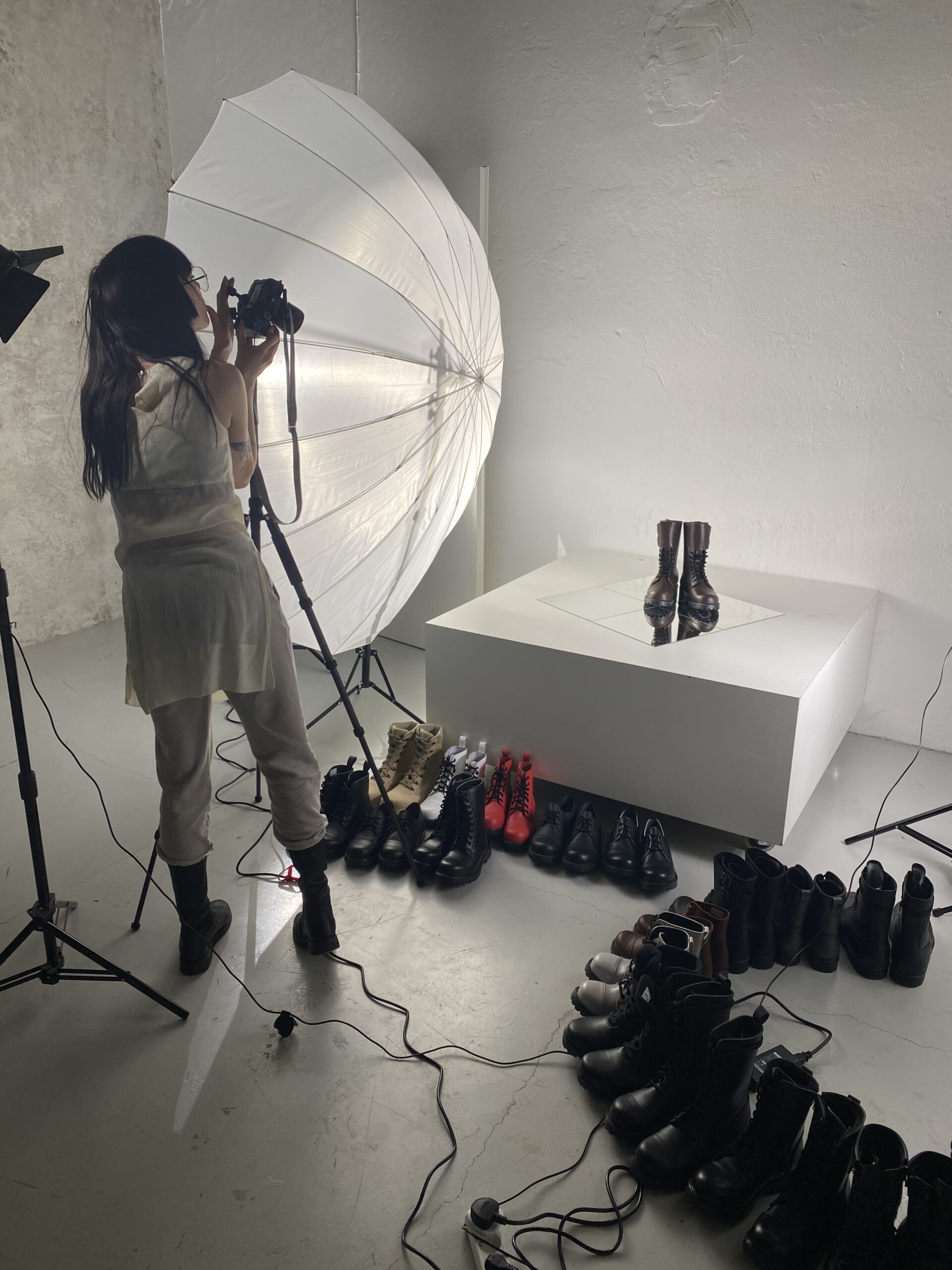
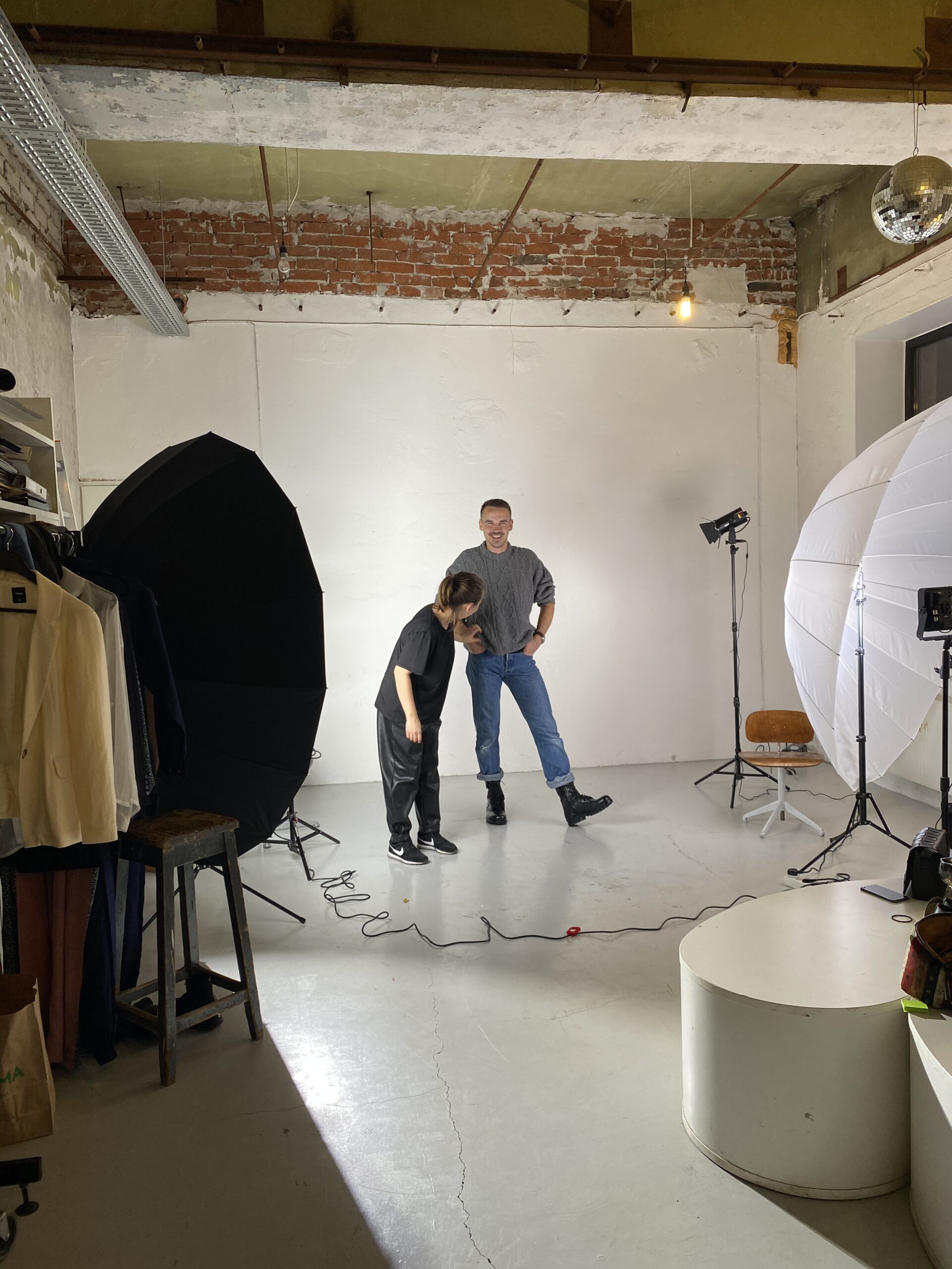
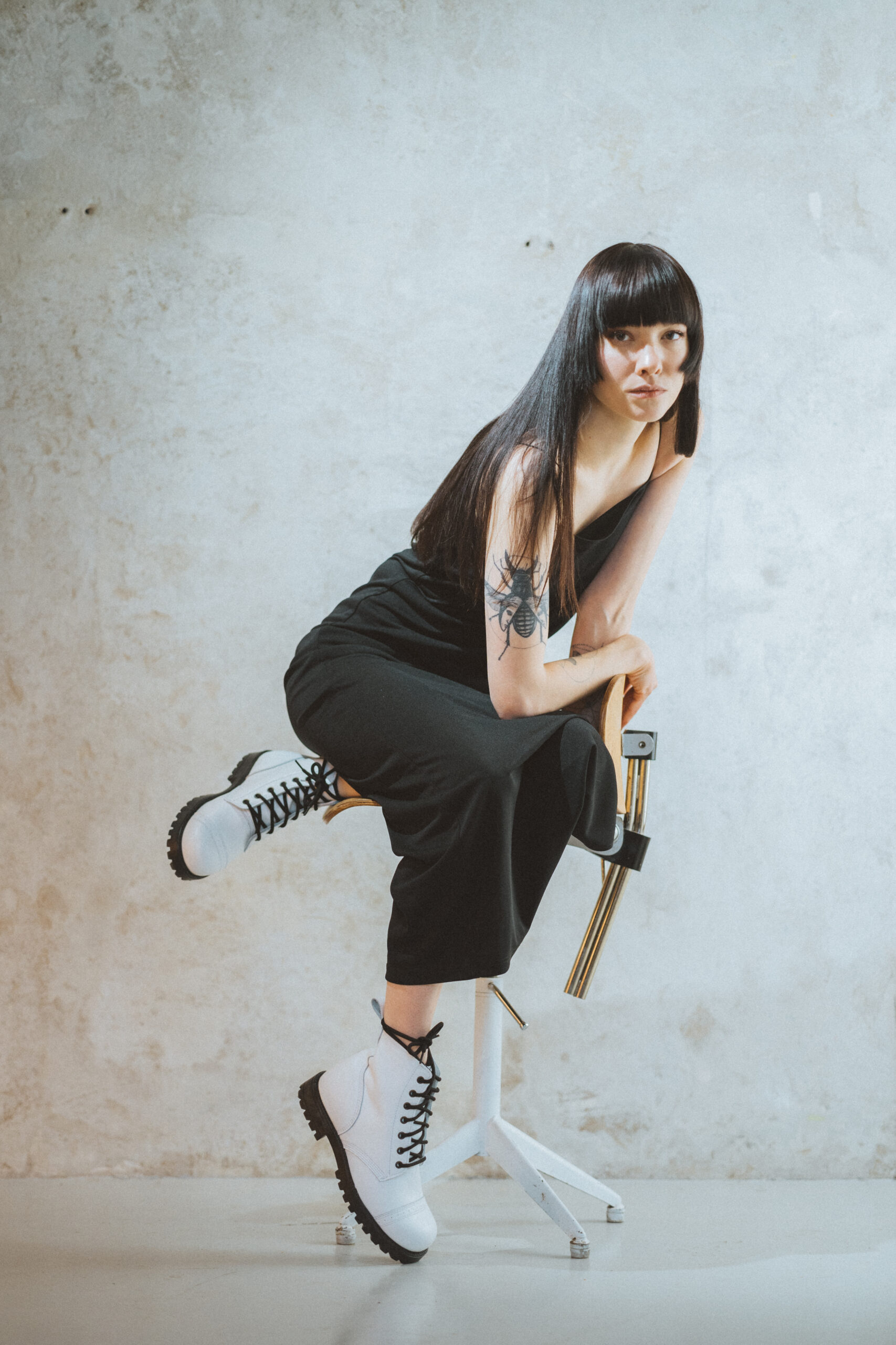
When we launched our test store, Saapavabrik, almost 4 years ago, I organized a photoshoot with some friends. I didn’t have much experience with studio photography (aside from a photography course I took in uni more than 10 years ago). We turned a corner of my friend’s art studio (who also was the art director and stylist) for this shoot into a makeshift photo studio and set up some lights. Our plan? To shoot about 30 pairs of boots on a white background from different angles, plus some styled shots with models. We worked all night, but we pulled it off.
Looking back, I think part of why the images work so well is because we genuinely enjoyed the process.
Fun fact 1: These first images are still our best performers in ads.
Fun fact 2: The female model in those photos was also the photographer—talk about a superwoman!


TL;DR: Start with clean white background images for a professional look, and remember to enjoy the process!
White background images are just a start. I’ll talk about the branding images in Part 2.