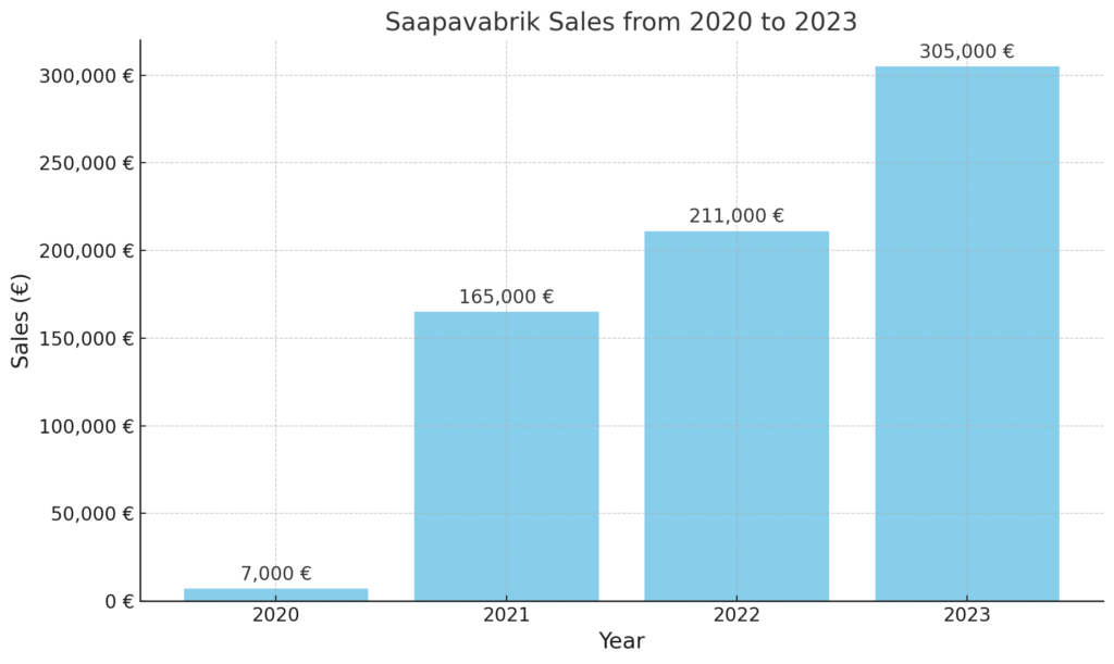
In 2023, our own test store for Hertwill, Saapavabrik (Boots Factory in Estonian), a shoe store focused on boots, slippers, sandals, and kids’ shoes for the small Estonian market, achieved over €305K in sales. In this guide, I’ll share how we got this far. It’s important to note that we reached this figure solely through sales from our own store—we don’t sell on eBay, Amazon, or any other platforms. Every market is different, and a bit of luck is always involved, but if you’re building your own online business, you’ll find some practical advice here to help your store get off the ground and grow.
General Approach We Took to Building Our Online Store:
- Research a niche and find something that sets you apart from other stores.
- Launch the store quickly, but ensure it looks nice and trustworthy.
- Offer only high-quality products that we would use ourselves.
- Start driving traffic as soon as possible.
- Learn and iterate until you find what works—what brings in sales.
- Scale after you’ve found something that works.

Team
There were three of us (Annamari, Roland and me), and in a way, we had the perfect mix of skills: one software engineer, one designer, and one marketing/e-commerce person. And we were building the store as a side project—Roland was leading the data team at Pipedrive, Annamari was a designer at Delfi Meedia, and I was consulting for a local media company. You don’t need a perfect team to build a successful online business, but it definitely helps to have people with different skills. We’ve noticed that stores partnering with Hertwill, particularly those run by a team, tend to be more successful than those operated by a single person. Plus, working with friends makes the process more enjoyable and brings a level of accountability beyond just yourself.

Budget
We each chipped in €250 at the start, giving us a total of €750. We spent about €60 on a WooCommerce theme, hosting service, and a domain name. The rest went towards ads. Later, we spent an additional €250 on a photoshoot, which we managed on a tight budget thanks to some friends—a photographer and a couple of others who modeled for us (Thanks, Jo, Toomas, Alice, and others). It’s always beneficial to have your own content and photos, but if you’re selling products provided by Hertwill, you don’t need to worry about that since we provide high-quality marketing photos.
So, in total, we had about €1,000. Generally, you need some budget to get a store running—it’s tough to do it without one, especially if you’re not an SEO guru or relying on free apps/plugins. Another thing we did, which I recommend, is playing the long game: reinvest all profits back into the business instead of taking money out as soon as you start making sales.

Store
You need to choose a niche for your store. The niche should ideally be a combination of three things: market opportunity (e.g., search volume vs. competition), available products (are there great products available for dropshipping in this niche?), and personal interest (it should speak to you at least a little). We decided on a boots store because we’re somewhat shoe enthusiasts (just a bit). We noticed that some of the keywords had considerable traffic, but the competition looked manageable (we used Google Keyword Planner for analysis). Plus, we knew we’d have great boots to sell from a manufacturer called Samelin. Samelin shoes are also available for dropshipping through Hertwill. For more on choosing a niche, check out my detailed guide.
We decided to focus on the Estonian market in the beginning. Although the market is small (only 1.3 million people), we knew it well and were aware that the competition wasn’t too tough. We also knew we could localize the store effectively and hopefully quick first sales.
The platform doesn’t matter much—if your store isn’t successful, it’s almost never because of the platform you chose, and switching platforms won’t change the outcome. Also, always pick one of the most popular themes (unless you’re an e-commerce pro who’s launched multiple successful stores). We built our store on WordPress + WooCommerce using the OceanWP theme (not the best theme in the world). But remember, as long as you stick to mainstream platforms (Shopify, WooCommerce, BigCommerce, Wix, etc.), you’ll be fine. Hertwill currently supports WooCommerce and Shopify. Still, you should compare them before making a choice based on your needs and skills (e.g., if you have no technical background, you probably shouldn’t choose WooCommerce; Shopify might be better for you). Some platforms like Shopify and WooCommerce also offer lots of themes—our recommendation is to Google and read reviews before making a decision, but whatever you do, prefer the most popular themes (e.g., for WooCommerce, Woodmart is one of the most popular and pretty good). If hosting isn’t included with the platform (like it is with Shopify), go for the most popular hosting services in your market—don’t choose an unknown player to save a couple of euros per month.
Name & Domain
First, your domain and store name should match. It’s easier to start when your store name reflects what the store is about, and if the store domain matches what people are searching for, it gives you an extra SEO boost. Also, avoid choosing a domain name with hyphens or anything that’s hard to spell just from hearing it. In Walter Isaacson’s great book “Elon Musk,” there’s a bit about how Musk regretted naming his first company Zip2 because people didn’t know how to spell it just by hearing it (Was it ZipTwo, ZipToo, Zip2, etc.?). We chose Saapavabrik, which means “Boots Factory” in Estonian. It’s easy to understand, remember, and type in. Plus, it has “boots” in the name.

Launch Quickly
Our goal was to launch the store as quickly as possible so we could start learning from real users about what works and what doesn’t. You want to start bringing in traffic as soon as possible. At Hertwill, we often see store owners spending months fine-tuning small issues that don’t really affect the bottom line. We built the first version of our store in one weekend and then fixed the issues over the next two weeks. We had extra motivation since December and the peak sales season were coming, and we wanted to be live before that. (In retail, it’s good to remember that for most categories, seasonality is important—most business happens during the colder months.)
Must-Haves in a Store
While launching quickly was a priority, our store, Saapavabrik, was—and still is—adequate and trustworthy. If your store looks unprofessional or untrustworthy, you’re dead in the water. It’s crucial that your store looks good not just on desktop but also on mobile, where most people will visit. The good news is that with most platforms, as long as you choose a popular theme, the overall experience should be fine. Here are some essentials to include in your store’s first version:
- Hero Image: The hero image should reflect your store’s niche and create a strong first impression. At Saapavabrik, we’ve been using the same hero image from our original photoshoot for over three years. Annamari, our UI/UX designer at Hertwill, has also written a short post on how to choose a hero image and where to source one. You can read it here.

- Main Slogan: Your main slogan should reflect your store’s values. While some stores can do without a slogan, most new online stores need to clearly communicate what they’re about. For example, if your ads highlight that you sell backpacks made in Europe, your store’s front page should reinforce that message. You can find more on this topic in my article on how to increase sales through better messaging.
- Design Elements: Stick to mainstream fonts and avoid using overly colorful fonts—they rarely work well. Dark backgrounds are also usually a bad idea unless you’re a professional designer. We see many merchants opting for dark backgrounds, but it’s better to avoid them.
- About Us or Story Page: This page should tell a real story about your store and mention the people behind it. A photo adds a personal touch. At Hertwill, we’ve noticed that 39% of the stores we partner with lack an ‘About Us’ page, even though analytics show it’s often one of the most visited pages for new stores. This is understandable, as it builds trust. For tips on crafting a compelling About Us page, check out this guide. Here’s a fun excerpt from our Saapavabrik About Us page that shows our humor and that it was genuinely written by us, not AI.

- Essential Pages: Your store should include Terms, Privacy, Shipping, Returns, and Contact pages—these are must-haves for building trust with customers. We made sure to include them in the first version of Saapavabrik.
- Favicon: This is a small detail, but many stores overlook it. Not having a favicon can hurt your store’s trustworthiness.
- Main Menu: Make sure your main menu includes categories. Some stores don’t, yet they aim to be full-fledged online stores. Also, avoid using a burger menu on desktop versions.
- Social Icons: Include icons linking to your social media pages, like Facebook or Instagram. These add credibility and allow visitors to check you out if they haven’t heard of you. Plus, you’ll need to create social accounts anyway to help drive traffic.
- Trust Icons: Display logos of the payment methods you accept in the footer. This helps build trust with your customers.

Trust icons used in Saapavabrik. - Footer: Ensure your footer contains important information like privacy policies, shipping details, and social icons. People often look to the footer for this information, so make sure it’s comprehensive.
- Payment Methods: Offer payment options that are known and trusted by your target customers. Avoid lesser-known providers, even if they offer slightly better terms—the small savings you might gain in fees won’t make up for the potential loss in conversions if the payment provider is unfamiliar to your customers. Also, consider how quickly payouts are processed—some providers, like Stripe, can take several days before funds reach your account. For expensive items like boots, offering “pay later” options can help with conversions. Klarna is a well-known provider of such services, but many others now offer similar options. We at Saapavabrik started with MakeCommerce as our payment provider, but soon switched to Montonio and have been very happy with them. They are a great option if you operate a WooCommerce store in the Baltics.
- Product Pages: Pay extra attention to your product pages. They should feature high-quality images, great product descriptions, and create a strong first impression. Avoid overwhelming users with too much text (we made this mistake initially) and ensure your product pages have breadcrumbs, which are especially important for mobile UX. People also love bullet points, so use them where appropriate. We also spent extra time ensuring that related products were displayed on every product page, and that returns and warranty information, as well as a size chart, were included. For a more thorough guide on optimizing product pages for higher conversion rates, check out this article.
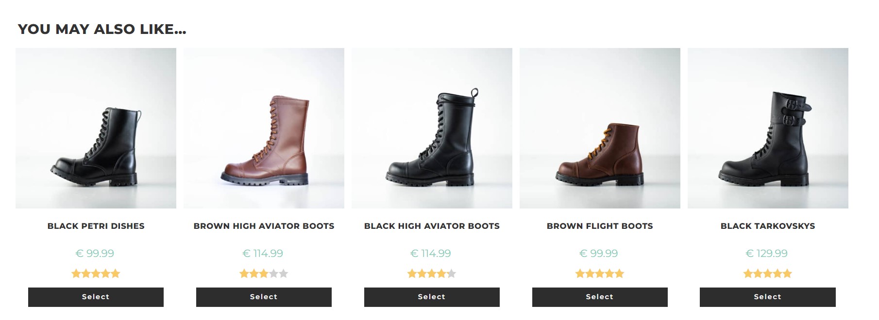
Related Products at Saaapvabrik. - Account Creation: You don’t need to offer account creation functionality. We often see new stores that force customers to create an account to make a purchase, which can be a deterrent.
- Popups and Notifications: We haven’t used any popups or browser push notifications. Unless you know how to implement them effectively (e.g., offering real value to customers), it’s best to avoid them. Simply asking customers to sign up for a newsletter without offering something valuable in return doesn’t count as real value. If you’re interested in collecting emails more effectively, check out this article.
- Search Functionality: If you don’t have many products, consider hiding the search bar. It can be an unnecessary distraction and might disappoint users if they don’t find what they’re looking for.
- Live Chat: Adding a live chat feature can be beneficial, so it’s worth trying. Hubspot offers a free chat option, but there are lots of options out there. Just make sure that whatever app you choose doesn’t cover important content in the mobile view.
- Cookie Consent: No matter what platform you’re using, there are plugins available that make adding cookie consent easy and relatively pain-free.
- FAQ: Initially, we didn’t have an FAQ section, but we added one later when we realized the common questions our customers had.
- Familiar Design: Your store should feel standard and familiar, meaning everything should be where customers expect it to be. For example, the shopping cart should be on the right side of the screen. Don’t try to innovate with the UI too —save that for when you’re established big ecommerce store.
To wrap up this point, don’t hesitate to ask for feedback on your store from e-commerce Facebook groups, Reddit, or friends who know the business. This not only helps you improve but also spreads the word about your store, and you might even make a sale. When we first launched Saapavabrik, I posted in the local nerd forum Hinnavaatlus, asking for feedback, and got some great tips and a valuable backlink. You can also send your store link to us at hello@hertwill.com, and we’ll give you some tips.
Products
As our store name, Saapavabrik (Boots Factory), suggests, we primarily sell boots and shoes. Like I mentioned earlier, our goal was to offer only high-quality products that we would use ourselves—we didn’t want to sell low-quality products or have our names associated with them. We chose shoes and boots not only because we knew about them (I’m a bit of a sneakerhead) but also because we felt we could create compelling content to sell them. Essentially, we wanted to sell products we’d be happy to recommend to our friends. We also considered that selling great products with word-of-mouth potential increases the estimated lifetime value of a customer and lowers acquisition costs in the long term.
This has proven true for Saapavabrik. On average, each customer makes about 1.5 orders from us, which might not seem like much, but our store is still new, and we’re not selling products that need to be restocked frequently (like cosmetics, for example). Additionally, our average order value is €77. Our top customers have bought 7 pairs of shoes from us, and some of our top business clients have purchased over 60 pairs—an unexpected but pleasant surprise that we hadn’t initially considered. Offering great products leads to higher customer satisfaction, low return rates, high repurchase rates, and potential word-of-mouth advertising.
We started Saapavabrik with just one brand (Samelin) and one category: boots. For the first few months, we had fewer than 25 products in our store. It was over six months before we added another brand and category (sandals). Even now, Saapavabrik carries only five brands, yet we generated over €305,000 in 2023. The brands we currently carry are:
- Samelin: About 73% of total sales, contributing €220,000 out of the total €305,000 in 2023.
- TOKU & Omaking: Slippers, sandals, and kids’ shoes brands that made up €45,000 or 15% of all sales.
- AIPI: Handmade boots, contributing about €17,500 or 6% of all sales.
- Kira Sustainable: Sustainable boots, accounting for about €15,000 or 5% of sales.
- Gift cards: Around 1% of all sales.
All of these brands and products are also available for dropshipping through Hertwill.
Champions
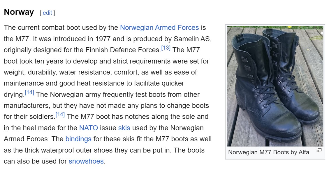
Before launching the store, we anticipated that the Norwegian M77 boots would be our champion product. These boots are well-known in the military world, even mentioned on the Combat Boots Wikipedia page, and are worn by the Estonian, Norwegian, and other armies. This existing recognition suggested there might already be some demand. To capitalize on this, we ensured that the M77s had great pictures, detailed description, and reviews, and we continue to spend a significant portion of our ad budget on these boots. We promoted them as all-purpose, no-nonsense boots—among the best in the world for their price. We also emphasized that they are manufactured according to NATO standards. This approach has proven to be effective.
Additionally, we found some content about M77s on YouTube, which we linked to in the product description to further engage potential customers. Our hypothesis was correct, as the sales data for 2023 clearly shows.
Top 6 Products – Revenue in 2023:
- Norwegian M77 Combat Boots: €40,000 (from just one product)
- Hawk Pilot Boots: €17,500
- Black Aviator Boots: €14,000
- Black High Aviator Boots: €8,500
- 511 Winter Boots: €8,000
- Black Desert Boots: €7,500
Top 6 Products – Quantity in 2023:
- Norwegian M77 Combat Boots: 387 pairs
- M77 Inner Socks: 197 pairs (frequently bought with M77 boots)
- Hawk Pilot Boots: 158 pairs
- Black Aviator Boots: 151 pairs
- Halla Slippers (Light Gray): 141 pairs
- Mustja Slippers (Dark Gray): 119 pairs
Product Titles
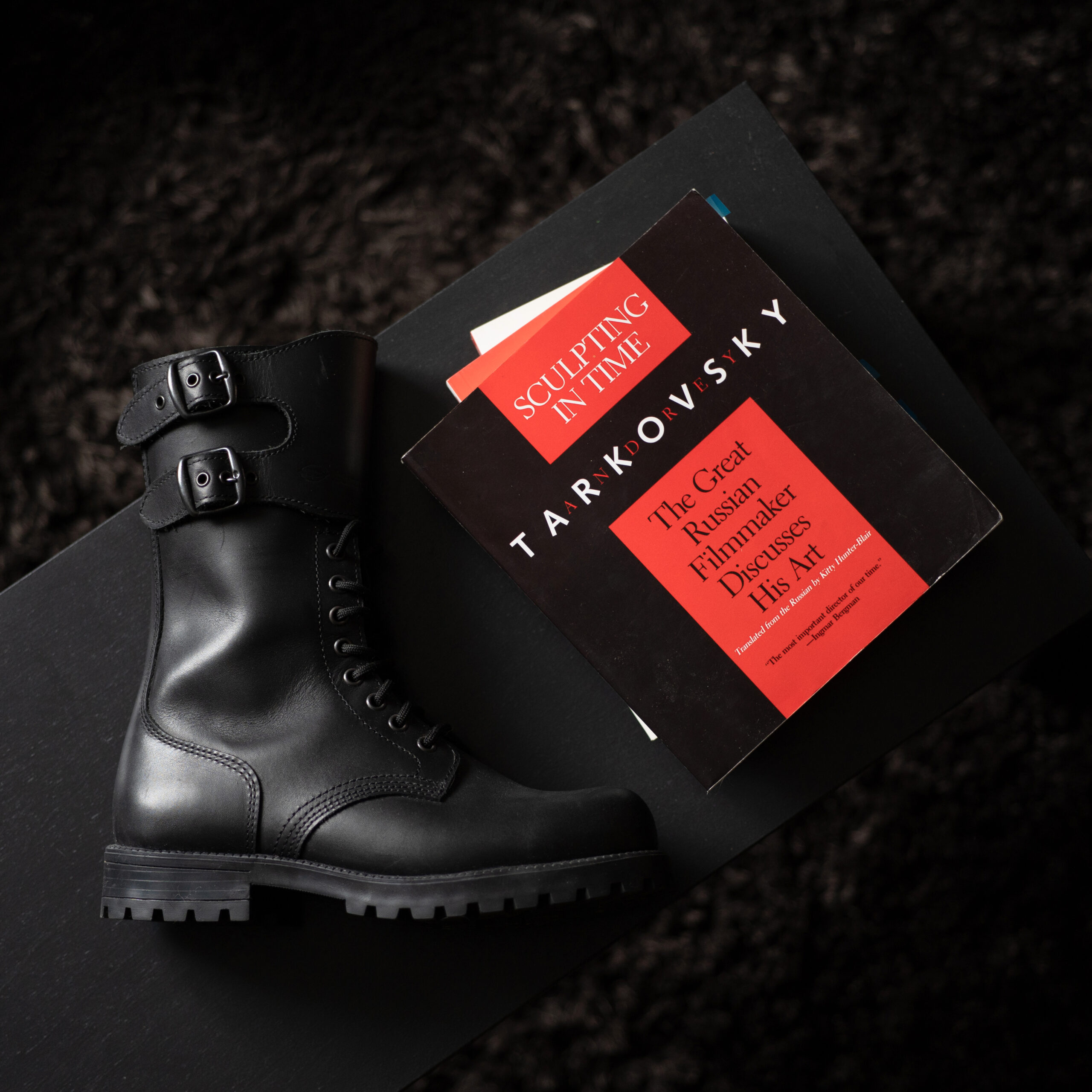
Most shoe models that Samelin manufactures, aside from the M77 Norwegian Combat Boots, are not well-known and originally didn’t have names—just codes (e.g., 517 582 400). To make it easier for our customers (and ourselves) to remember and refer to specific models, we decided to rename most of them. For example, we named the 517 582 400 model “Red Aviator Boots,” as recommended by the factory owner, and the 791 582 100 model “Tarkovsky Boots” after I had just watched Andrei Tarkovsky’s movie “Stalker,” and this model of boots looked like something you’d wear in the Zone. One of our first customers, a Finnish guy named Petri, ordered two pairs of the 51119 boots, so we renamed them “Petri’s,” and the 51120 model (same boots with fur) became “Rich Petri’s.”
While you shouldn’t start renaming your products blindly, it can make sense in certain cases, such as when products don’t have distinctive names, just long barcodes, or when you want to create additional differentiation from your competitors. However, the names should be believable and relevant.
Descriptions
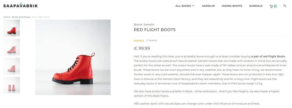
We really took the time to craft great product descriptions, and I highly recommend doing the same. At Saapavabrik, every product description is written by us. We leveraged Samelin’s rich history to make the products more appealing, consistently mentioning that the boots are made in Europe, are produced for multiple NATO armies, and that Samelin has partnered with Dr. Martens. We also highlighted the main selling points with bullet points. For the boots we personally wear or that are our favorites, we included this information in the descriptions to add a personal touch.
If customers frequently asked the same questions, we made sure to address those in the product descriptions (e.g., whether the boots run large). For some products, we even compared them to competitors—such as mentioning that a similar pair of Dr. Martens, not made in Europe, costs nearly twice as much. If you’re an overachiever, consider adding an FAQ block after the description. In general, your product descriptions should convey that you really know your products and that you’re an expert in your field. Taking the time to create well-crafted descriptions can set you apart from other stores, many of which don’t put much effort into this aspect.
Pictures
We took our own product pictures and photos with models (our friends). If you’re selling products provided by Hertwill, we’ll supply you with product and marketing images. However, if you have the resources, I recommend ordering the products you sell for yourself or your family and creating some of your own content. An added benefit is that you’ll become more familiar with the products you’re selling. It’s incredibly effective when a potential customer asks about a product, and you can confidently say, “I recommend them—I have them myself.”
Product Categories
Don’t overthink it and avoid having too many categories. For example, initially at Saapavabrik, we had just one category: Boots. While you probably shouldn’t have just one category, it’s important not to overcrowd your store with too many. We still don’t have an excessive number of categories, and while it might make sense to have separate sections for women, men, and kids, it hasn’t been a priority for us. One thing you can do is check how people search for products online to decide on category names—Google Keyword Planner can be helpful for this.
Pricing of the Products
- To be honest, we set our prices very instinctively, not through detailed Excel sheets. Early on, we briefly experimented with higher prices, but we quickly shifted our strategy. Our main idea was to start with lower prices to get some sales rolling in and then gradually increase them. Basically, we initially sold boots at cost and even lost money (for example, we sold Aviator Boots at €79 with free shipping, which was basically at cost). Once we started getting sales, we began raising prices. This strategy was about getting orders in first—the profits would come later once we had established ourselves in the market.
- Later on, we moved from instinct-based pricing to using an Excel sheet, which we still maintain, to track our costs and profits and adjust prices accordingly. It’s a simplified approach, but it includes factors like the cost of the product, average shipping costs, VAT, average return cost per order, marketing spend per order, customer support cost (which we’ve outsourced), and other costs per order (e.g., hosting, software).
- We also used charm pricing, inspired by Richard Shotton’s book The Choice Factory: 25 Behavioural Biases That Influence What We Buy. This means all our prices end in 9. Prices ending in nine are thought to increase conversion rates because people subconsciously associate them with a better deal. Additionally, it leaves more money in your pocket since people read prices from left to right, and that €79 generally feels like a better deal than €76.
- One thing we didn’t focus on was what others were selling the same boots for. For example, there’s a local, city-funded design store in Tallinn that sells boots basically at cost in their online store. We didn’t worry about it and have been outselling them by at least 10x. We also felt that if you sell boots made in Estonia/Europe at a very low price, it devalues their worth. After all, boots made in Asia can cost €100–€200, but locally made boots following NATO standards, sometimes with Vibram outsoles, cost less than €100? That wouldn’t make sense.
- If I were starting now, I would experiment with higher margins on some products to allow room for discounts. For example, I would test whether a product priced at €99 sells better than the same product priced at €129 with a discount down to €99. Probably, the latter would work better.
Get High from Your Own Supply
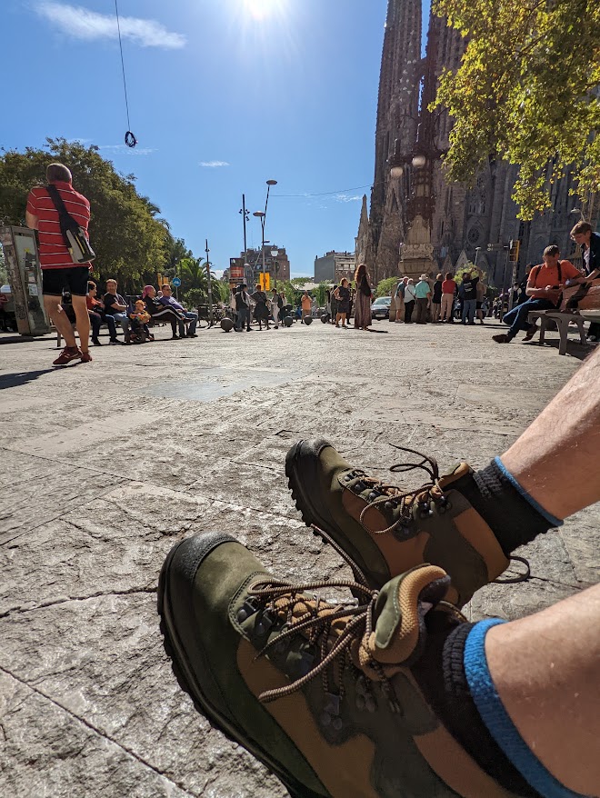
The Notorious B.I.G. famously rapped, “Never get high on your own supply,” but one of the things we did was buy a pair of boots for ourselves. Roland and I bought Hawk Pilot boots, and Annamari got a pair of Aviator boots. We used these boots for content creation, including pictures, ads, social media posts, product descriptions, and even customer support. Owning the boots ourselves meant we could personally vouch for them. If a customer was considering buying a pair of Hawk Pilot boots, I could tell them directly via email or chat that these boots are great—I wear them myself. Samelin boots are genuinely high-quality; I now also own their hiking boots. Here’s a low-quality picture of my Samelin hiking boots and my feet near Sagrada Familia. We, of course, leveraged this picture in social media and Facebook ads, earning hundreds of likes:
Here’s an example of how we incorporated our personal experience into the product descriptions, taken from the description of Hawk Pilot boots:
The Hawk 2548 model, also known as Pilot Boots, are full-leather military boots by Samelin, specially designed with pilots in mind. These boots are constructed on the M77 base, known for its quality and durability, but feature quick-lace fasteners with Velcro that allow the laces to be concealed. Additionally, the boots have a waterproof zipper on the inner side. The upper is made from water-repellent 2.2-2.4 mm thick chrome leather, and under the tongue, there is a Cambrelle textile lining for extra padding, making them even more comfortable to wear. The removable anatomical insole is shock-resistant, antibacterial, breathable, and washable. These pilot boots are made to NATO military unit standards, complying with the NATO-AQAP 2110 quality system. In summary, these are honestly very good and durable boots—we know because they are the everyday boots of the founders of Saapavabrik, Roland and Joosep.
To sum up, my point is that you don’t need a large number of brands and products in your store. Having a few brands and products allowed us to focus more effectively. By “focus,” I mean taking the time to create great product descriptions and overall excellent copy, as well as dedicating more time to ads and customer support. Initially, your store should feel more like a boutique offering a curated selection of great products with great content, rather than trying to be an “everything” store—you can’t compete with giants anyway. Saapavabrik is still a shoe boutique that offers no-nonsense, durable, locally made shoes. You can read more of my thoughts on product selection here.
Bringing in Traffic
At Saapavabrik, our general strategy was to start driving traffic as quickly as possible. We wanted to learn what works and what doesn’t, so from the outset, we focused primarily on paid ads since SEO takes time, and we had more expertise in paid advertising. As a general rule of thumb, you should focus on what you know best. For example, if you have experience in SEO, concentrate on that. If you excel at creating organic TikTok content, go for it. Our approach, regardless of the channel, was to stand out and be different—otherwise, we wouldn’t stand a chance against bigger e-commerce players.
Here are a few other things to keep in mind:
- We use Google Analytics for tracking and analytics. It’s free, easy to set up on most e-commerce platforms, and at a basic level, requires no coding skills.
- We still don’t stress too much about attribution. The focus for a new online store should be on generating traffic and sales and assessing if your margins can sustain the costs, rather than pinpointing, for example, whether Facebook is responsible for 20% or 25% of your sales.
- It’s important to remember that while your initial focus should be on getting as many visitors as possible to start learning and iterating, as your business matures, you don’t want to rely solely on one or two channels for traffic. Ideally, over time, you want the proportion of visitors who come directly to your website by typing in the URL or who are subscribers of your newsletter to grow. This way, you’re more protected against algorithm changes on platforms like Meta, Google, or TikTok. At Saapavabrik, our direct traffic is currently around 15% and has been steadily increasing each year as we become more well-known (though, of course, this percentage might include visitors who initially got the idea to type in our URL from an ad or social media content).
- Initially, we reinvested all the money we made from sales back into paid ads to generate even more sales. The goal at that stage was growth, not profit. We knew that once we reached a certain scale, the flywheel effect would kick in, leading to profitability and increasing traffic from free or low-cost channels. We were confident that with our high-quality products, there would be lots of repeat purchases, word-of-mouth referrals, more organic traffic, and, ultimately, growing brand awareness.
Organic Social
- We started—and still only have—Facebook and Instagram accounts. We would probably add TikTok or switch to it, but we’re still new to TikTok. Our initial goal was to quickly reach a couple of hundred followers, so we invited our friends, colleagues, and acquaintances to follow our accounts. We even spammed our group chats and asked people in bars to follow us right away, and then spammed some of them again to like our posts on Instagram and Facebook. In fact, our first sale came from this effort when our friend Kaarel made an order after we promoted our store (we offered nice discounts to our friends). We’ve also noticed that ads tend to perform better when the account running them already has some followers. In addition to spamming friends, you can run ads to gain followers or host a giveaway. If you go the giveaway route, make sure the prize is relevant to your store so you attract followers who are your target customers—giving away an iPhone might not be ideal unless you’re selling iPhones.
- In general, we don’t post much on our Facebook and Instagram accounts—usually not more than once a week or biweekly—but you should aim to post more frequently. Our content often revolves around products, product reviews, or, now that we’re more established, content sent to us by our customers. We’ve also reached out to influencers or well-known people who have ordered from us, offering a discount or refund in exchange for a picture or two. Friends and family can also be a great source of additional content. Here are some examples of our collaborations at Saapavabrik.
- We also seize opportunities to make jokes whenever possible. For example, we sell shoes from TOKU called Kuutsid, which in Estonian sounds like “Gucci,” so we advertised them with the tagline: “No, they are not Guccis.” When we saw the “Sad Keanu” meme, we noticed that the boots he was wearing were similar to Samelin hiking boots. So, we’ve made the same viral post twice, suggesting that Keanu is probably not wearing our hiking boots.

Sad Keanu - The first brand we sold at Saapavabrik was Samelin, and we leveraged their rich history to create engaging content. Whatever brand you sell, be sure to use their story and strengths to market their products effectively. Here are some storytelling strategies that we’ve found successful when selling Samelin boots at Saapavabrik, and we consistently applied thes across social media, ads, and in-store.
- European Craftsmanship: Highlight that all Samelin shoes are proudly crafted in Europe. Unlike most shoes from other retailers, which are either not made in Europe or come with a significantly higher price tag.
- NATO-Approved: All Samelin combat boots (M77, Hawk Pilot boots, Desert boots, 739 boots) are manufactured according to NATO standards. Additionally, all Samelin shoes adhere to ISO 9001 standards.
- Military-Grade: If Samelin boots are trusted by NATO troops, they’re more than suitable for everyday individuals in need of reliable footwear. The Norwegian, Latvian, and Estonian armies have used or are currently using boots manufactured by Samelin.
- High-Profile Partners: Samelin’s former partnerships with Rossignol and Dr. Martens add credibility. Mentioning these names helps establish trustworthiness. In our test store in Estonia, we also included links to the same product on Varusteleka’s website to show that Varusteleka sells basically the same product at a much higher price.
- Built to Last: Samelin boots are durable, no-nonsense, and made in Europe. They’re “real boots” for people who value quality over flashy brands with huge PR budgets. If you prefer reasonably priced, durable boots made in Europe, Samelin boots are for you.
- Worry-Free Warranty: All boots come with a 2-year warranty.
- Decades of Experience: Samelin has 75+ years of experience in the boot business—this is something to proudly showcase.
- Affordable Premium: Samelin proves that quality and affordability can go hand in hand. Make sure your customers know this.
- Reviews and UGC: In the early days of Saapavabrik, we reached out to every customer, asking if they were satisfied with their purchase. If they were, we requested permission to use their feedback in our store, ads, and social media. Some of this feedback has been used as content for more than three years, and it still works. Always follow up on every order and ask the customer if they’re happy with their purchase. If the feedback is positive, ask if you can use it. If it’s not favorable, you’ve at least learned something valuable. You probably don’t need more convincing, but according to Nosto, user-generated content packs an 8.7x stronger punch than influencer posts and is 6.6x more persuasive than branded content. Additionally, 79 percent of people say that user-generated content significantly impacts their purchasing decisions.
- Testing and Iteration: In the beginning, we tested different content types to see what worked best—experimenting with visuals, text, etc. Don’t be boring, and avoid posting random AI-generated content. If you need ideas, look at the social accounts of brands you personally admire.
- Reusing: If something worked well, we would repost it after some time had passed. For example, for the first three years, we didn’t offer any discounts at Saapavabrik, so every Black Friday, we made a viral post saying, “Our fans already know, but just in case: we are not doing discounts at Saapavabrik, even on Black Friday.”
- Boosting: If we saw that some content worked organically, we added a few euros (usually €3-10) to boost it.
Facebook Ads
Besides Google Search Ads, Facebook ads were our main traffic channel in the early days, and they still account for around 15% of Saapavabrik’s traffic. In total, we’ve generated approximately €101,000 in direct sales from Facebook ads according to Google Analytics, with a return of €5.20 for every €1 spent. Although Google Ads typically have a better ROAS than Facebook ads (which is true for us as well), I believe Facebook ads are particularly valuable in the early days to quickly attract cold traffic and test different value propositions and visuals. While users on Google Search often have a purchase intent, Facebook ads can help create that intent.
Here are a few key insights from our experience:
- Simple Account Structure: Our account structure is straightforward, with only two main campaigns: one for traffic and another for conversions. Occasionally, we run an engagement campaign, like for page likes, but 90% of the time, we stick to these two campaigns. For traffic, we’ve found catalog ads targeting a broad audience to be the most effective. For conversions, remarketing catalog ads to visitors from the past 60-90 days have worked best. We don’t exclude customers who have already made a purchase. However, based on our experience with stores partnering with Hertwill, often a simple conversions campaign is sufficient, and there’s no need for a separate traffic campaign.
- Goals: In the Ad Set settings, set the goal to either ‘Maximize Conversion Value’ or ‘Maximize Conversions’ and choose ‘Purchase’ as the Conversion Event. We used ‘Maximize Conversions,’ but ‘Maximize Conversion Value’ might make more sense depending on your goals.
- Broad Targeting: Instead of setting specific target groups for our ads, we opted for a broad audience and trusted Facebook to find the right people, regardless of whether our primary goal was conversions or traffic (except for remarketing campaigns).
- Remarketing Campaigns: If you decide to run a remarketing campaign like we did at Saapavabrik (which I do recommend), it’s essential to ensure your remarketing audience isn’t too small—being exposed to your ad too many times can be counterproductive. Remarketing campaigns on Facebook are most effective when you already have some traffic. Don’t hesitate to extend the retargeting window to include visitors from the last 90-120 days, and don’t exclude recent purchasers—they might buy again. Additionally, consider including individuals who have engaged with your Facebook or Instagram accounts in your remarketing audience.
- Facebook Conversion API: It’s a bit technical, but we use the Facebook Conversion API, and you should too. The Facebook Conversion API allows advertisers to send marketing data, such as website and app actions, directly to Facebook, improving ad targeting and potentially lowering advertising costs. The Facebook Conversion API is especially important in a post-cookies world. You can find a Conversion API guide for Shopify stores here and for WooCommerce stores here (the WooCommerce guide is for the PixelYourSite plugin, which Meta itself recommends for WordPress sites).
- Ad Creatives: We dedicated time to crafting and testing different ad visuals and texts, using dynamic creatives to see what resonates best. User reviews have consistently performed well. The primary goal of most ads is to interrupt the scrolling, even if only for a moment, which can be achieved through striking visuals and compelling copy. Of course, the ultimate goal is not just to stop the scroll but to convert. Our approach was to be bold, aiming to connect deeply with a few who love our copy, visuals, and, ultimately, our products and store. The goal isn’t to play it safe and be liked by everyone. If your business grows large, it may naturally evolve into something more conventional and safe anyway.
- Long-Running Ads: If you find something that works, don’t be afraid to run the same ads (visuals and copy) for years. Once you find messages that resonate, use them extensively—so much so that you get sick of them. And then use them even more. When you’re tired of these messages, that’s when your first real customers will start to understand and remember them. For instance, if your distinguishing value proposition is “All our bags are handmade in Europe,” it should be present in every ad, post, newsletter, and transactional email, even if it’s just a side note.
- Budget: Our initial budget was €5 per day, and now, depending on the season, it’s between €15-40 per day. Initially, we reinvested all the money we made back into ads to generate more sales, and then we reinvested again into ads.
- Learning and Optimization: Especially in the beginning, check your ads manager and Google Analytics frequently to see what’s working and what isn’t. However, keep in mind that it takes some time for a Facebook campaign to get out of the learning phase (at least 5-7 days).
You can also browse our ads here (note: they are in Estonian): Facebook Ads Library – Saapavabrik. For more in-depth advice, check out my thorough Facebook Ads guide for small online stores here.
Google Ads
In terms of ROI, Google Ads has proven to be our best channel. For example, in 2023, it generated around €134,000 in revenue at a cost of €14,900. Compared to Facebook ads, Google Ads allows us to target individuals who are further down the sales funnel and already have purchase intent. In total, we’ve generated more than €350,000 in Saapavabrik sales from Google Ads.
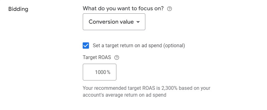
- Setup: The primary conversion goal for our account is ‘Purchase.’ For all campaigns, the marketing objective is ‘Sales,’ and we opted for the ‘Conversion Value’ bidding strategy to maximize the return on our ads.
- Search ads have accounted for more than 75% of the total revenue from Google Ads. This makes sense because if you target the right keywords—those with reasonable competition and enough volume—and your store matches well with these searches, the ROI can be excellent. People searching for specific items (e.g., winter boots) are already further down the funnel; they don’t need to be convinced that they need the product, only that they should buy it from you. We did thorough research using Google Keyword Planner and also tested various searches directly in the Google search bar. We added numerous keywords to different ad groups, such as a separate ad group for military boots, another for shoe stores we compete with, and yet another for winter boots. We then monitored what worked and what didn’t, making adjustments accordingly.
- We also started using display ads soon after launch, with just a €1 per day budget (and we still run some to this day). While we understood that they don’t convert nearly as well as search ads, we knew that, alongside Facebook ads, they were a cost-effective way to put our store in front of a large audience.
- We also run Performance Max, Shopping, and automated search campaigns, but they make up a smaller portion of our spending and sales. I believe that getting search ads to work well for your store is key to making Google Ads effective overall.
- Don’t underestimate the importance of ad copy and visuals. Yes, for search ads, your copy should include the words people use in their queries, but your ad still needs to stand out. So don’t be afraid to be different, even in Google Ads.
- Monitor your campaigns and make adjustments—especially in the first few months until you get them working properly. Check your campaigns multiple times per week and make changes as necessary. But at the same time, patience is key for results. Campaigns need to run continuously, as the learning phase can last from a few days to weeks, depending on traffic. Pausing or making big changes can reset this phase, reducing targeting effectiveness. We’ve seen many merchants quit too soon, after just a week, without giving their campaigns enough time to improve.

Merchant waiting for Google Ads to bring in sales. - And like with all channels, it doesn’t matter how well you do your ads if your store looks bad, your products are subpar, or they don’t match your ads.
- Budget: We currently spend around €50 per day on Google Ads, although the budget varies with the season—autumn and winter are peak times because people buy more boots then! However, we started with just €4 per day for the first three months. My friend, who is the head of Google products at one of the largest agencies in the region, recommends that the minimum budget for a campaign should be at least €200 per month in smaller markets and between €500 and €1,000 in larger markets. It’s possible to work with smaller budgets if your targeting is exceptionally precise and on point.
- Similar to Facebook ads and social media, I generally wouldn’t recommend outsourcing Google Ads—unless you have a lot of money—especially in the beginning. Google also offers courses on how to do Google Ads: Google Skillshop.
- You can read more of my thoughts on Google Ads in this post: Google Ads Practical Tips for Small Online Stores.
TikTok Ads
As millennials, we haven’t fully embraced TikTok yet, and we haven’t tried running TikTok ads so far. However, you should definitely consider running TikTok ads (in addition to creating organic content), and if your market supports it, launch a TikTok shop as well. Some merchants are seeing amazing results through TikTok.

Organic Search
We don’t have much expertise in SEO and wanted to drive traffic as quickly as possible, so our focus was primarily on paid channels. However, we did ensure that our title and description tags were optimized, our sitemap was in order, and we tried to secure some backlinks. We should have focused more on naming our categories in line with how people search; for example, having separate categories for women’s and men’s boots would have made also sense from an SEO perspective since people often search this way.
We managed to get some local backlinks by listing our store in local directories like neti.ee and participating in forums, including the tech forum Hinnavaatlus, where I asked for feedback on the store. Later, we also received backlinks from some of the manufacturers we work with. We didn’t start content building (e.g., launching a blog) because we didn’t have the resources for it. We use Ahrefs’ free site audit tool to discover any technical SEO aspects we might miss, and we occasionally check Google Search Console to monitor our performance. SEO is definitely an area where we could see significant improvements.
Email & Newsletters
We started collecting emails right away, but instead of using popups, we included an option at checkout where customers had to tick a box saying, “I don’t mind when Saapavabrik emails me from time to time. We promise we won’t spam.” This might not be the most optimal approach, as it’s generally best to keep all non-essential information out of the checkout process, but we’ve kept it this way. Although we began collecting emails early on, we didn’t send our first newsletter for a few years. However, when we finally did start sending them, albeit rarely, the results were impressive—most newsletters generated over €1,000 in direct revenue, which is not bad for a small online store.

We use Klaviyo for Saapavabrik newsletters, as well as for Hertwill. It’s a great tool, especially for e-commerce, and it allows you to set up abandoned cart flows, which are excellent for conversion. Although we soon stopped sending newsletters to focus on building Hertwill, this is one channel we would prioritize if we were focusing on growing Saapavabrik. Newsletters are great because they’re relatively inexpensive, offer a high customer lifetime value, and are less dependent on external factors (e.g., Google algorithm changes, though Gmail changes can be tricky). Essentially, email is the only channel you truly own besides direct traffic. I highly recommend starting to collect emails as soon as possible. You can find some ideas on how to do this in this blog post.
Browser Push Notifications
We all hate them, so we’ve decided not to use them. It’s probably not the most rational decision, as we might be leaving some money on the table, but that’s our approach. If you’re enthusiastic about it, you might want to give it a try, as some stores are making money from browser pushes.
Branding
- Although I’ve listed it last in terms of bringing in traffic, branding doesn’t usually drive direct traffic, but it influences everything—from attracting visitors to increasing conversions. When you’re just starting your online store, the focus should be on driving traffic and generating sales as quickly as possible. However, as time goes on and you start to find your footing, you should begin emphasizing brand building. By building a brand, I mean everything from the products you sell and how your store and social media look, to your customer support, the media attention you receive, and the influencers you collaborate with.
- The key is to determine what makes your store different and how you can put your store and values in front of as many eyes as possible so that people notice and, better yet, remember. I recently listened to a great episode of the Uncensored CMO podcast where Greg Hahn, founder of one of the hottest marketing agencies in the world, and show host Jon Evans discussed how being different and bold is crucial. They emphasized that being dull and boring will cost you a lot of money. Ignorance from customers toward your messages, ads, and products is worse than any reaction, even a bad one. If your messages are boring and dull, you’ll need a massive budget to repeat them everywhere for people to notice and remember. But most small online stores don’t have the budget for that.
- We aren’t perfect at differentiation at Saapavabrik, but we’ve doubled down on our message that our shoes aren’t for everyone. If you care about famous brands, we’re not for you. We even run ads saying that our boots are probably not for you. We directed some traffic from our website to Dr. Martens, telling customers that if they care about brand names, they should go there, but if they care about no-nonsense, durable boots made in Europe, they’re in the right place. Our messaging is laid-back and often humorously exaggerated, even to the point where it’s intentionally over the top. We’re as straightforward as possible—for example, if we run a giveaway on Facebook, we tell people it’s to gain more followers, not just an act of generosity. Or when we post about not offering discounts, we explain that our boots are fairly priced and don’t need a discount. In general, the content we create and the store we run align with our personal values. The jokes we make, whether good or bad, reflect who we are. It’s hard to pretend to be someone you’re not. So, don’t copy our copywriting or messaging tone—find what works for you and speaks to your customers or people you want as your customers.
- At Saapavabrik, as we started becoming more well-known, we began receiving requests from fashion shows and theaters to borrow or buy shoes from us for their productions. For example, the Estonian National Opera will feature shoes purchased from us in their show this autumn. When a local women’s magazine, Anne & Stiil, wrote about flashy shoes in their spring edition, they reached out to borrow shoes from us. If someone on TV wears our shoes, we share and boost it on social media. We’ve also partnered with a few micro-influencers who had already bought shoes from us. However, we recommend that any online store making some sales consider proper partnerships with influencers. By “proper partnership,” I don’t mean one-off deals but longer-term collaborations where the influencer’s followers match your ideal customer group, and the influencer can offer their audience a discount code.
In very simple terms, building a brand for your store means doing things that bring positive attention to your store and the story you’re telling, even if it doesn’t result in direct sales right away. In the end, building your store isn’t much different from building your own brand.
Converting
Our conversion rate for 2023 was 1.49% (total number of orders divided by total sessions). While this is far from perfect and leaves plenty of room for improvement, our primary focus has been on building our premium dropshipping app, Hertwill, so the Saapavabrik online store has largely been running as is. However, during the active period when we were launching and getting the store properly up and running, we rigorously monitored our conversion rate using Google Analytics and constantly worked to improve it.
We also tracked average order value (AOV), but it wasn’t as much of a focus for us, mainly because we primarily sell boots, which are already higher-priced items. Since people usually buy just one pair of boots at a time, we didn’t feel that bundles or upsells would be particularly effective—especially since we didn’t want to add low-priced items like shoelaces, boot polish, or shoehorns to our store to create reasonable bundles with boots. If we had more resources, we might have explored this further. One exception to this is the M77 boots inner socks, which are frequently bought together with the boots, although we don’t offer them as a bundle.
Here are some things we did (and some we didn’t but should have) to improve conversions. Remember, the key is to experiment with different strategies and find what works best for your store.
- Sometimes, the reason your traffic isn’t converting is that your webpage and products don’t match the traffic you’re bringing in. For instance, if you’re promoting a great selection of sandals (like we did initially) but only have three models available, it’s a waste of money—they won’t convert. In this case, you need to either add more sandals or adjust your targeting and messaging to better align with what’s available in your store. We did both: we added more sandals, refined our Google Search Ads keyword groupings, and even paused our sandals ads and keywords for a while. Essentially, the goal is to ensure that what you promise outside of your store matches what customers find inside once they arrive. Of course, your store also needs to look professional and trustworthy. At Hertwill, we often see stores that look incomplete—no matter how much or what type of traffic you bring in, these stores just don’t convert.
- We closely monitored Google Analytics to see which pages people were visiting and then worked to improve those pages. For example, we noticed that many people were checking out the M77 boots product page but then leaving without making a purchase. We realized that although we had a great product description, it was too long, so we shortened it by about 70%. We also initially didn’t have a size chart, which we added later. When we saw that visitors frequently visited the About Us page, we put effort into making it more engaging and trustworthy. Additionally, we removed some fields from the checkout process to make it less overwhelming (in general, fewer fields and clicks = higher conversion). Later, we added some fields back when we realized we had removed too much. Overall, our goal was to improve the user experience by focusing on the pages that people visited the most.
- We also used the funnels view in Google Analytics to understand where customers typically dropped off in the purchasing process.
- Low Prices: We started with slightly higher prices but quickly lowered them to get our first sales. This is something I recommend for all stores. The goal isn’t to make a profit at the beginning—that comes later. The initial goal is to get sales and gradually raise prices.
- Remarketing Ads: If you’re a new, unknown online store, especially one selling more expensive products that aren’t impulse buys, people rarely purchase on their first visit. The easiest fix is to remind them about the products they viewed and about your store. We found the most effective remarketing ads on Facebook targeted visitors from the last 60-120 days, combined with a product catalog so they see the items they checked out. You can try a similar approach with Google Ads. If you do email marketing (which, as mentioned earlier, we aren’t doing in Saapavabrik but should be), it’s relatively easy to include previously viewed products in your newsletters.
- Abandoned Cart Flows: You should set up abandoned cart flows so that when someone adds something to their cart but doesn’t complete the checkout, they receive a reminder email. This often works to bring them back, especially if the email includes a discount and highlights the products that were left in their cart. When I was head of e-commerce at one of Estonia’s best-known retailers, we even sent three shopping cart reminders to people who didn’t complete their purchase. There are separate apps for setting this up, but you can also do it with almost any newsletter software, including Mailchimp, Klaviyo, or Smaily. For ideas on what these emails should look like, here are some examples from HubSpot: HubSpot’s Abandoned Cart Email Examples. We didn’t implement this at Saapavabrik, but I’m including it here because it’s such an effective strategy.
- Free Returns: Especially with shoes and clothing, offering free returns can be a great conversion booster. Make sure you have a separate subpage with return information, but also include this information on your product pages. Test whether this helps with conversions—if it does, but you start getting a lot of returns, work on reducing the return rate and consider building some of the return costs into the product price (for example, we calculate €1 of return cost into each product’s price).
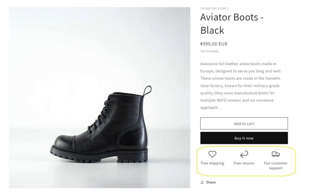
- Free Shipping: Offering free shipping can help boost conversions, but it might be most effective when offered for orders above a certain amount. We initially offered free shipping on all products, but that worked because our cheapest item was €79, and we had factored the shipping cost into our margins. I wouldn’t recommend offering free shipping on everything if your store also sells lower-priced items—free shipping might make more sense for more expensive items. However, if you always offer free shipping on everything, the impact diminishes since it doesn’t create a sense of urgency (no fear of missing out). A good rule of thumb is to offer free shipping starting from a certain order value and to occasionally make special offers for free shipping. For example, you could include a special offer in shopping cart reminders, like “Order today with code X and get free shipping.” But take this advice with a grain of salt and test what works best for your store.
- Warranty Information: Including warranty information on every product page and in ads can boost conversions by reducing any doubts customers may have. We started doing this, and it helped reassure customers about the quality and reliability of our products.
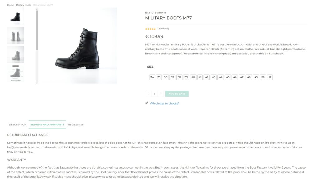
Warranty and exchange information on the product page. - Discounts and Sales: Discounts and sales will help with conversions. Although we haven’t run any discount campaigns at Saapavabrik and have built a story around not offering discounts, they might be necessary for most stores. You can read more of my thoughts on running sales campaigns here: How to Run Sales Campaigns. Additionally, consider trying BOGO (Buy One, Get One) offers, bundles, and upsells/cross-sells—there are apps that make these types of offers easy to implement in your store. While they may not all improve conversion rates, they can increase revenue and average order value. I mentioned earlier why we haven’t done much of this at Saapavabrik. Also, when running a sale or special offer, consider using a countdown timer to create urgency. Shopify Apps for Marketing and Conversion.
- It’s very simple, but we missed this initially: Make sure that bestsellers are listed first in the catalog view. Also, ensure that filtering products is easy and straightforward (something we still don’t have in Saapavabrik—unfortunately, you can’t filter by available size, for example).
- Mobile Experience: This is something we occasionally overlook at Saapavabrik, and we see other merchants do the same: most visitors to your store are on mobile, but you build your site on desktop. This can lead to elements that look great and are user-friendly on desktop being less effective or even frustrating on mobile. For example, a live chat feature might hide something important on the mobile version of your site. One simple change that significantly improved our conversions was adding a button with a clear CTA like “Shop Now” on the front page for mobile users. While we don’t have it on the desktop version (though we probably should), at least there, users can easily navigate to products with one click from the main menu. On mobile, however, the burger menu requires extra clicks, and we know that extra clicks can kill conversions.
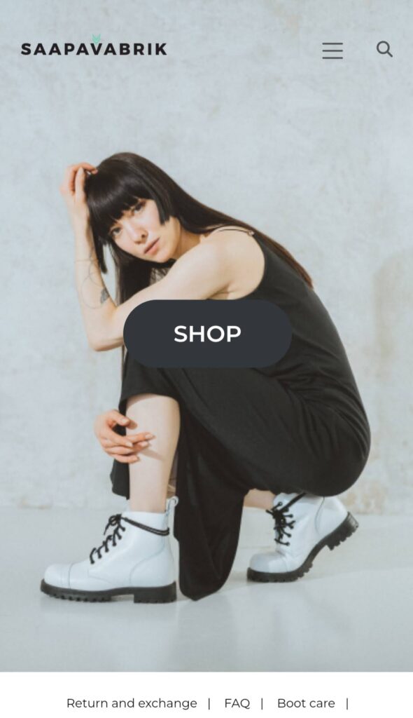
Yes, the ugly button in the middle of the screen is what I’m talking about. - Reviews and Ratings: We started reaching out to every customer right away, asking if they were happy with their order. If they were, we encouraged them to leave a review on our store. As our sales grew and people began complimenting our products in ads and social media comments, we reached out and asked if we could use those positive comments on our store, social media, and ads. Reviews have proven to be a significant boost in sales.
- Influencers and Famous People: I’ve already mentioned partnerships with influencers, but it’s worth emphasizing again. If you can partner with well-known individuals, they add credibility to your products, store and brand. When you collaborate with them, be sure to ask if you can feature their comments and recommendations on your product pages and throughout your store.
- Adding More Products: Sometimes, the solution can be as simple as adding more great products. Your visitors might not find what they’re looking for in your store, or you might discover that even if certain products aren’t popular, they can still boost the sales of your bestsellers. For example, at Saapavabrik, we added pink hiking boots. While they looked great and worked well in ads and on social media, they unexpectedly boosted the sales of our black and green hiking boots. You can also use tools like Hotjar or other survey tools to ask users on exit if they found what they were looking for. If you’re considering adding new products, Hertwill offers awesome products from real brands.
If you have a lot of traffic that doesn’t convert, the issue might sometimes be that you’re bringing in the wrong traffic. However, more often, it’s a matter of conversion optimization. You need to try and test different strategies to find what works. This could mean lowering prices on some of your most-viewed products and raising prices on others to conduct A/B testing, or it might involve setting up an abandoned cart flow. The key is to continuously test and improve.
Customer Support
Our approach to customer support was inspired by the great book Delivering Happiness about Zappos, the big online shoe retailer later acquired by Amazon, which is famous for its exceptional customer support. I can’t emphasize enough how important it is for a new and unknown online store to offer great support.
- For the first 18 months, we handled all customer support ourselves. Once we started averaging five-figure monthly revenue, we outsourced it to a friend who was home with small children. Our goal was to be as available as possible, responding as real people and even adding some humor when appropriate. We also wanted customers to know who was behind the emails, chats, and phone calls, so we made a conscious effort to be as non-anonymous as possible.
- Initially, in addition to a contact form and email, we also had live chat and my personal phone number on the website. As our volume grew and we focused more on building Hertwill, we removed the live chat and phone number. We used Facebook Messenger for live chat, but tools like HubSpot, Intercom, and LiveChat are all good options. Whatever you choose, make sure it helps customers without being intrusive—especially on mobile, where it shouldn’t obscure important functionalities.
- We responded to all comments on social media, whether positive or negative.
- Whenever possible, we went the extra mile. For example, when we realized that Samelin boots run large and customers were ordering sizes that were too big, we made it clear in the product descriptions: “When in doubt, go one size down.” We also included size comparisons with Nike and Adidas in the size chart and even added this comment to descriptions: “I, Joosep, usually wear size 44.5 in Nike and Adidas, but size 43 in Samelin boots fits perfectly.” For about a year, we also included free extra insoles with all boots. These were inexpensive but helped customers whose boots were slightly too big, and it was great value to let them know we included extra insoles at no cost. We eventually stopped offering them after finding that most people didn’t use the extra insoles.
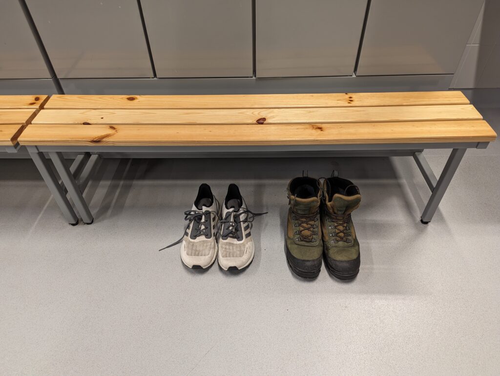
My running shoes and Samelin hiking boots, which we used on social media to explain size conversion between Adidas and Samelin (the picture quality is bad, but it worked). - When we noticed recurring questions, we made the information easily accessible on product pages or a subpage. For example, we created a boot and slipper care guide and started including the weight of hiking boots in product descriptions since this was a frequently asked question.
- If something went wrong with an order, we went the extra mile to fix it—unless the customer was being unreasonable. Our philosophy was that if you resolve an issue and make the customer happy, they’re likely to become loyal advocates, even more so than those whose experience was flawless from the start.
- We also reached out to every customer in the beginning to ask if they were happy with the product and their order, and we requested reviews if they were satisfied.
In the end, we believe that thanks to not only our great products and content but also our customer support, we have gained many advocates for our store.
Bloopers and Funny Stories
- When our store was already doing very well, we accidentally copy-pasted the order number into the amount field while processing a return payment. As a result, we refunded €7,000 instead of €109. We realized the mistake later that same day but couldn’t get hold of the customer—he didn’t respond to emails, and his mobile phone was turned off. The bank told us they couldn’t do anything. The next day, the customer got back to us—he had been hiking in Georgia with no reception, which is why it seemed like his phone was off. He laughed about the mix-up and returned all the money.
- In another incident, a customer somehow got hold of our bank account details and transferred €149 to us directly, then got angry when we didn’t fulfill the order. It turned out he had never ordered from an online store before and thought that simply transferring the money would result in the boots being delivered, rather than placing an order through the website.
- A local well-known design store, one of our competitors, stole our pictures and used them on their online store. When we confronted them, they initially yelled at us, denying everything and insisting they would never do such a thing—but 15 minutes later, the pictures were gone.
- In the early days, we oversold about 50 pairs of red Aviator boots because we mistakenly believed a new batch would be ready by a certain date. We miscommunicated with the manufacturer about the timeline, which led to several angry customers—but sometimes, these things happen.
Summary
All in all, I think the key factors that made our store successful, allowing us to generate over €305,000 in sales and €50,000 in profit in 2023, can be summed up as follows:
- Great high-quality dropshipping products from a brand with a compelling story (locally made, NATO-grade quality). This also boosts word-of-mouth and repurchase potential.
- A well-chosen niche: We focused on a niche shoe store specializing in local shoe brands and no-nonsense, durable boots at a reasonable price.
- Original copywriting: From ads and social media content to product descriptions, we made sure our story stood out.
- Fast iteration and improvement: We prioritized getting things done over perfection. We launched quickly, learned from real data and users, and continually improved, especially in driving traffic and converting it.
- A great team: Our team of three brought together different skill sets—engineering, design, and marketing.
- Excellent customer support: We consistently went the extra mile to provide outstanding service.
- Luck: There’s always an element of luck behind every success story.
And if you’re wondering what we’ve done with all the profits from Saapavabrik—initially, we reinvested everything into growth, mainly for customer acquisition. However, for the past few years, we’ve put all the profits into building Hertwill. Essentially, Saapavabrik, along with investment from a venture capital fund, enabled us to quit our day jobs and pursue our dream of building Hertwill full-time.



thank you so much for such a detailed and infomative shop history. i thoughly enjoyed it, lots of useful interesting snippets.
kind regards
Dec