
Every sale in your store usually goes through your product pages, highlighting their importance. If your product pages aren’t up to par, your sales are significantly negatively impacted, After reviewing over 100 stores that have partnered with Hertwill, we’ve pinpointed common errors and straightforward fixes to improve the conversion rate of your product pages and, consequently, your store’s overall performance. Also, what started as a quick list of tips ended up as an extensive set of 54 ideas. It turned out longer than expected, but this gives you the freedom to pick and choose what works best for you.
Furthermore, monitoring the impact of any changes on conversion rates is essential, as the ultimate objective is to boost these rates. When testing modifications, consider increasing traffic to these pages with ads to get quicker results. Based on our experience, here are the key insights:
Essential Actions for Product Pages
- Analytics: Use the Analytics tab in your Shopify admin or Google Analytics to identify pages with high traffic but no sales. These pages are prime candidates for optimization to improve conversion rates, potentially uncovering missed revenue opportunities.
- Compare and Contrast: Analyze product pages with high conversion rates against those that don’t convert well. Look for differences beyond the product itself that you could apply to improve the underperforming pages.
- Page Layout: Stick to familiar layout structures for product pages. Innovation in layout can often lead to confusion rather than increased sales.
- Product Title: Ensure the product title is clear, understandable, and in the language appropriate for your target market. Selling to the Finnish market with product titles in English, for example, could significantly hinder conversions. Remember, great product titles are crucial not only for the product page but also for browsing, ads, and SEO.
- SLUGs: Often overlooked, SLUGs (the part of the URL that identifies a particular page) should accurately reflect the product page and be in the same language as your store. Aim for short, keyword-rich, and descriptive SLUGs.
- Title Tag and Meta Description: Ensure these are well-crafted, as they impact how your product pages are shared and found in search engines.
- High-Quality Images and Videos: Use clear, high-resolution images and videos that showcase the product from multiple angles. Including real people wearing or using the products can be beneficial. Make sure the best pictures are displayed first. If any pictures are of low quality, remove them. Consider A/B testing to find out which product images perform best as the first picture. Going the extra mile with 360-degree and 3D images can also make a difference.
- At a Glance or Short Product Description: Ideally, your product page should start with a short, engaging description that captures the essence of the product. This brief overview should be compelling enough to convert visitors into buyers by providing a quick snapshot of the product’s value. In most cases, this concise description should be followed by a more detailed and informative one, catering to visitors who seek in-depth information before making a purchase.
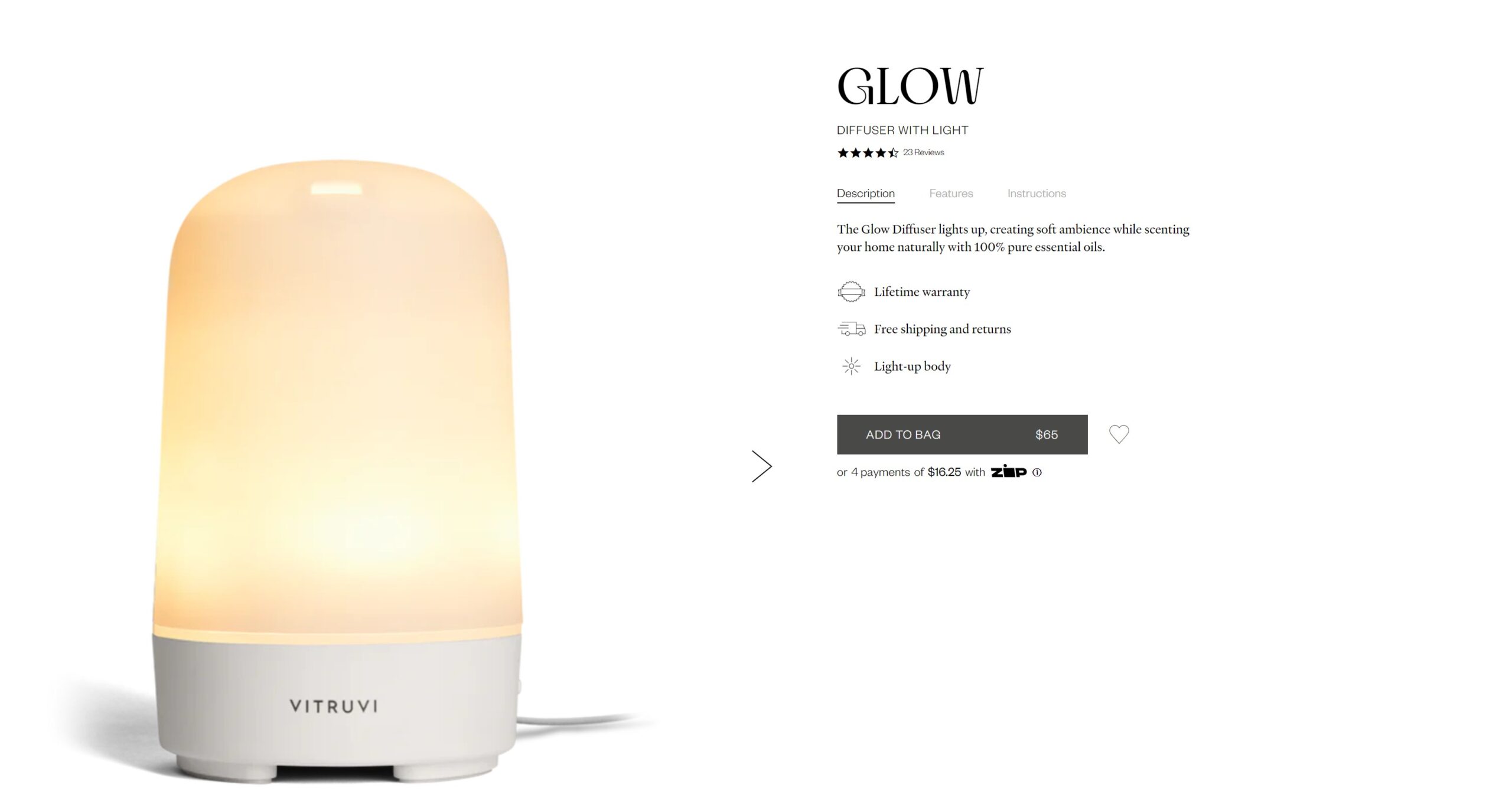
- Engaging Product Descriptions Matter: Take some time to write compelling, informative descriptions that highlight the benefits and features of the product. However, note that even long product descriptions shouldn’t be too long. Use bullet points for easy scanning and include any unique selling points – what makes your product special compared to others (e.g., handmade, made in Europe, etc.). Tailor descriptions to your target market. For example, if you sell Samelin boots to the Finnish market, it might make sense to mention that the Finnish army uses Samelin boots and that Varusteleka sells boots manufactured by Samelin, albeit at very high prices. Or if you sell military bags, ensure that the product descriptions reflect that professionalism. Use AI tools if necessary but ensure that the text doesn’t appear to be generated by AI. Also, use AI or grammar tools to check for grammatical mistakes. Sloppy grammar and typos aren’t trustworthy. It’s common sense, but the product descriptions should be in the language your target market speaks. I’m not covering SEO here, but it’s not bad if product description also includes relevant keywords for SEO purposes.
- Focus on Benefits: Instead of listing every feature, highlight the benefits that matter most to your target audience. This helps them easily see how the product meets their needs. For example, say ‘These are the warmest slippers you’ve ever worn’ instead or in additon to ‘The insole is made of lambswool.’
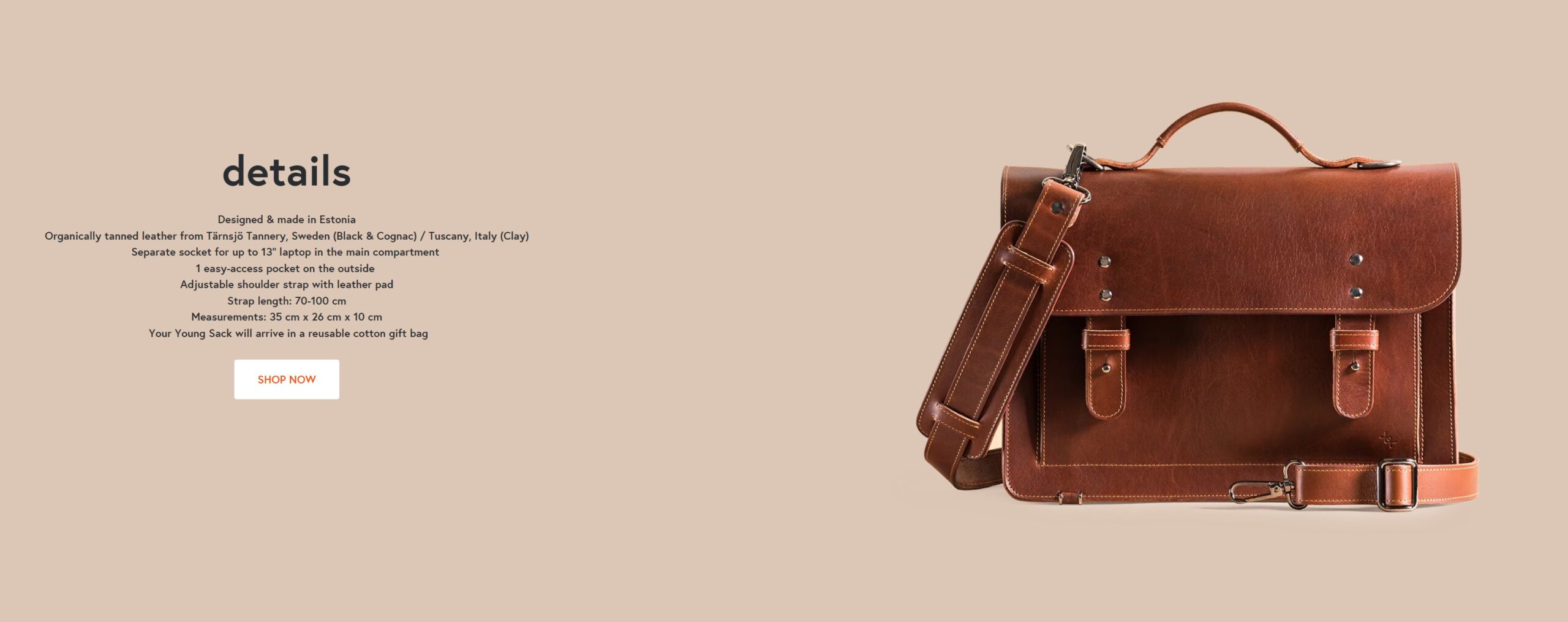
- Detailed Product Specifications: Include a detailed list of product specifications, such as dimensions, materials, care instructions, and technical features. This information helps customers make informed decisions and reduces the likelihood of returns.
- Consistency in Language: Ensure that the entire product page is in the same language. We’ve seen product pages intended for the German market where the product name is in German, the slug is in English, and the product description is half German, half English. This inconsistency kills conversion.
- Product Page Content and Traffic Match: If most of the traffic to your product page comes from outside your store (e.g., Google, Bing, ads, etc.), ensure it matches the channel. For example, if the product page receives a lot of traffic from Google when people search for keywords like “leather backpack” or “handmade backpack,” ensure that the product title and descriptions match well with this traffic. The same goes for ads – the product page should match the messaging you use in ads for this product.
- Strong Call-to-Action: Ensure that the “buy” button is eye-catching and clear.
- Ratings and Reviews are Absolutely Necessary: Data shows that users trust reviews more than product descriptions. Reach out to your customers directly to ask for their feedback, initially through a personal email rather than an automated solution. If the feedback is positive, ask for permission to use it in your store. At Hertwill, some products already include reviews that you can showcase. You can also get creative. For instance, in our test store, Saapavabrik, we linked our M77 product page to the Varusteleka M77 boots page, allowing customers to see reviews on Varusteleka and see our more competitive pricing. So consider leveraging reviews from external sources, like YouTube, for products such as the M77 boots.
- Breadcrumbs: Breadcrumbs are crucial for navigation, especially on mobile devices. They help users keep track of their locations within your website.
- Brand Visibility: It’s essential for users to easily see and click on the brand name on the product page to access more information. Many product pages overlook this crucial detail, missing an opportunity to connect customers with the brand.
- Delivery Time: Visitors should be able to see the delivery time on the product page, especially if you offer quick delivery.
- Transparent Return Policy: Clearly outline your return policy on the product page. Knowing the return process is straightforward can make customers feel more confident in their purchase. It is not enough that you already have it in the footer.
- Mobile Optimization: Mobile browsing is more important than desktop. Review your product page on mobile devices to ensure that it’s user-friendly. A common issue is overly long product descriptions on mobile, which can deter potential buyers.
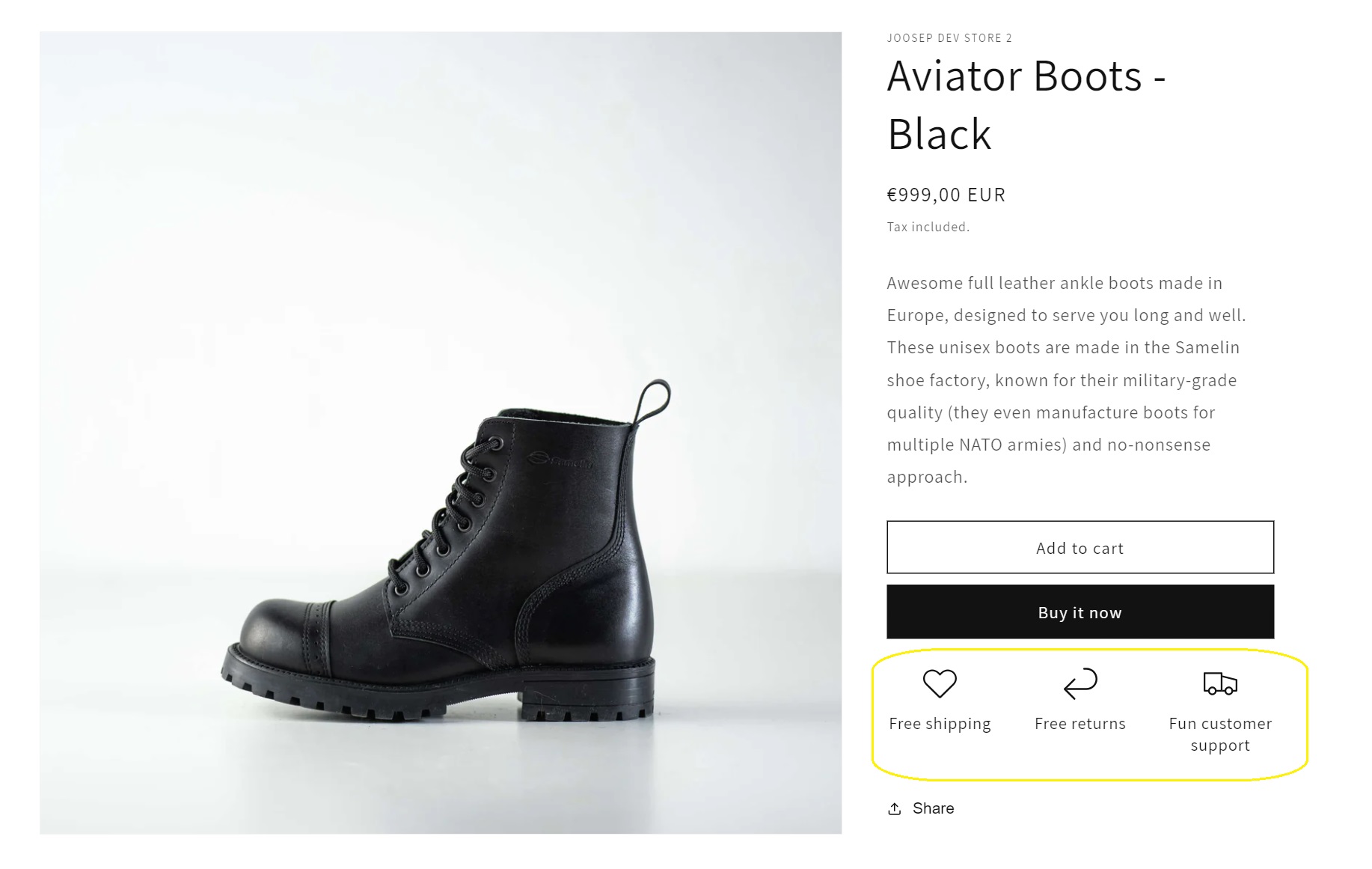
- Free Shipping: If you offer free shipping, either universally or specifically for the product, highlight this prominently. According to the Baymard Institute the best spot is near the Add to Cart button. Despite potential banner blindness, where users might ignore banners or popups, placing this information directly on the product page ensures visibility. Implementing this change is straightforward, requiring no coding and just 5-10 minutes of your time.
- For Shopify Stores: Go to Online Store > Themes, click on Customize, then navigate to Theme Settings > Product Card. Here, you can add an “Icon with Text” feature right after the Add to Cart button. This approach should work for most themes, although there may be exceptions.
- For WooCommerce Stores: First, install the “WooCommerce Single Product Page Customizer” plugin (or a similar plugin). In the plugin settings, select the “woocommerce after add to cart button” position from the dropdown to place your message, which is considered the optimal spot. Your message could be customized to your store’s policy, such as “Free shipping” and “Free returns.”
- Size Guide: Essential for clothing and footwear, size guides help minimize returns and boost conversions. Size quizzes can be extremely effective, though they might be overkill for smaller online stores. Alternatively, referencing well-known brands for size comparison, such as providing a shoe size guide that compares your products to Nike or Dr. Martens sizes, can be helpful. Here is a sample of Fit Finder.
Nice to Have & To Test
- Countdown Timers: Display a message or timer indicating that if an order is placed before a certain time, it will be delivered by a specific date or shipped out on exact date.
- Add product benefits as a picture to the gallery. According to the CXL blog, most visitors don’t scroll through the product page; instead, they view the picture gallery, suggesting that displaying product benefits as images in the gallery makes sense. The test case featured in the CXL blog resulted in a 14% increase in conversion rate and an improvement in ROAS from 0.95 to 1.51 through this improvement.
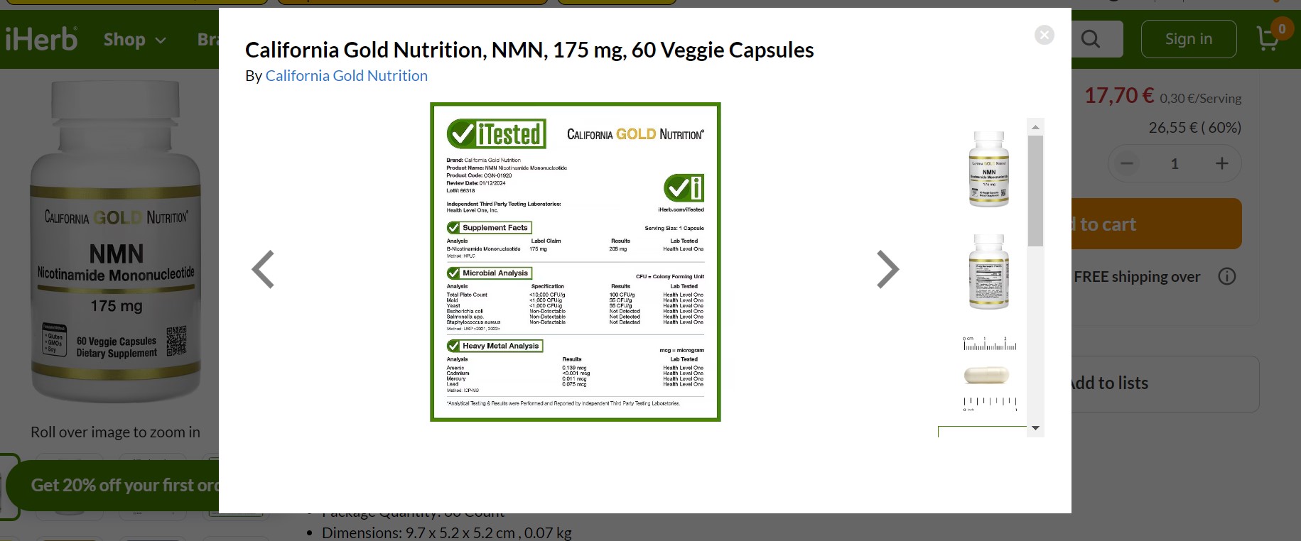
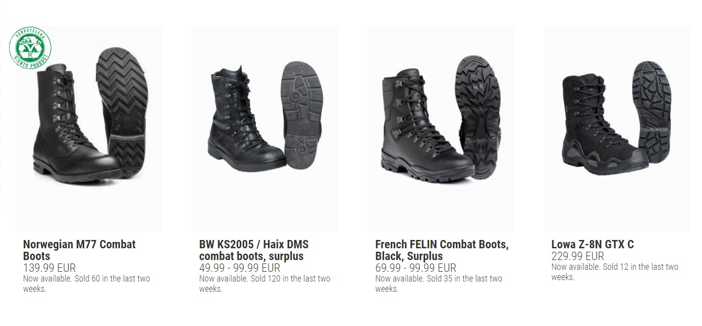
Product benefits as an image in the iHerb store. - Sales Numbers: Mature stores sometimes display how many units of an item have been sold to serve as social proof. A notable example is the Finnish outdoors retailer Varusteleka, which uses sales figures to build trust and encourage purchases.
- Product Comparisons: While useful, focus on this feature only if your store isn’t small or limited in product selection.
- Use Scarcity: Enhance urgency by showing limited stock availability with phrases like “Only a few left in stock!” to encourage quicker purchasing decisions.
- Related Products and Upsells: It’s important to showcase related products or upsells that genuinely relate to the item being viewed. A common mistake we observe is featuring ‘related’ products that are, in fact, completely irrelevant
- Warranty Information: Displaying warranty information can be reassuring (all Hertwill products come with a warranty).
- Add Personalization Options: Offering customization, such as adding a message to a leather wallet or bracelet, can significantly boost sales. Some Hertwill products offer this feature.
- Usage Instructions/Care Information: For more sophisticated products, providing how-to-use or care instructions can be helpful.
- Heatmaps and Recordings with Hotjar: Use Hotjar to analyze how visitors interact with your product pages, tracking clicks and scroll depth. This insight can be invaluable for optimizing your pages. However, it’s not categorized as ‘must-have’ because many stores set it up but fail to regularly analyze the data or make informed decisions based on these insights, rendering this tool useless.
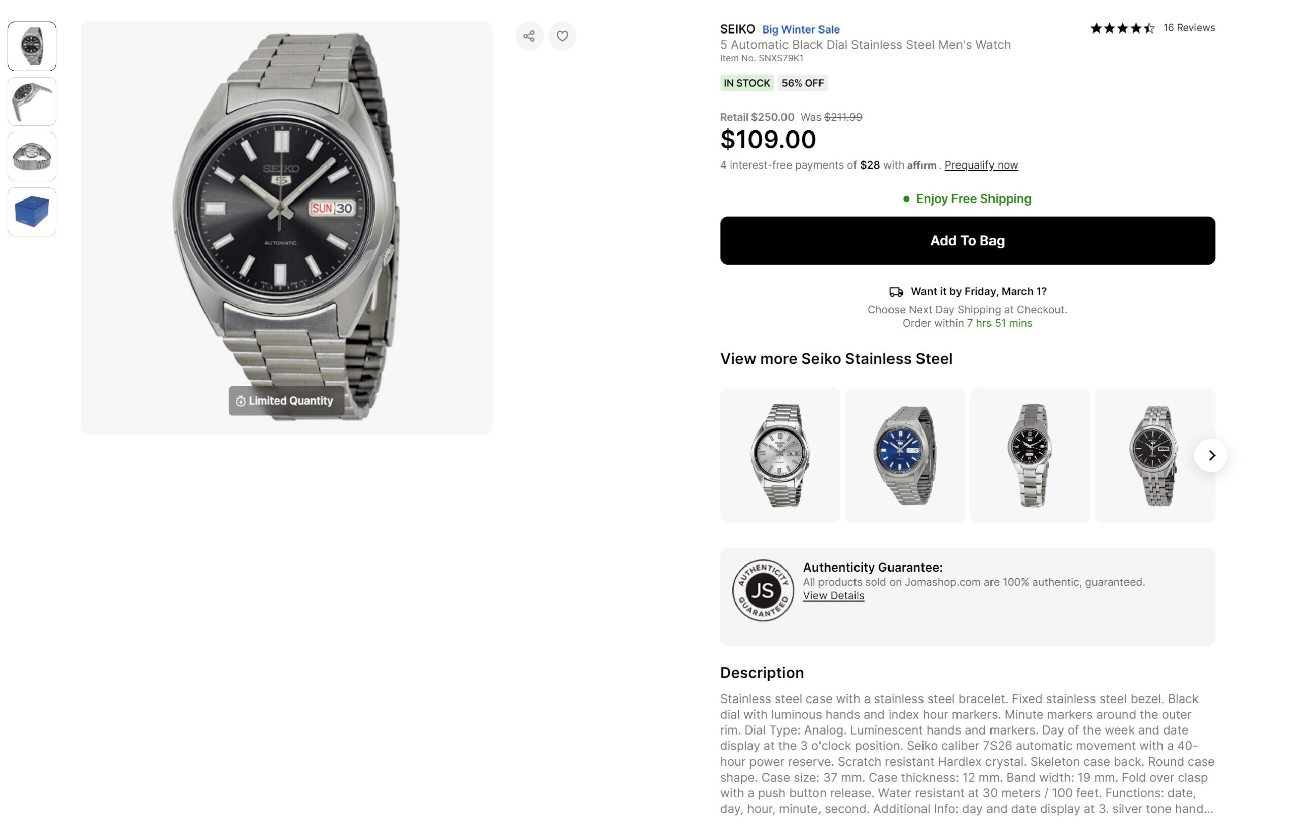
- Money-Back Guarantees and Other Guarantees: Highlighting money-back guarantees can significantly enhance trust, but be prepared that you may indeed need to issue refunds. It’s worth experimenting with, as it could provide the extra reassurance customers need to finalize a purchase. Additionally, consider showcasing other types of guarantees. For example, Jomashop‘s authenticity guarantee is a great way to build confidence in your products and speaks to their customers as fake watches are a real problem in watch world.
- Split Payments for Expensive Items: Clearly indicate if you offer installment payments or split payment options, such as Klarna, on the product page. This information is valuable for customers who might be considering it before reaching checkout. Additionally, always opt for solution providers that are well-known in your market to ensure trust and reliability.
- Buy Now Options: Test the effectiveness of direct payment buttons (e.g., Apple Pay, Google Pay, PayPal) on the product page if your payment provider supports them.
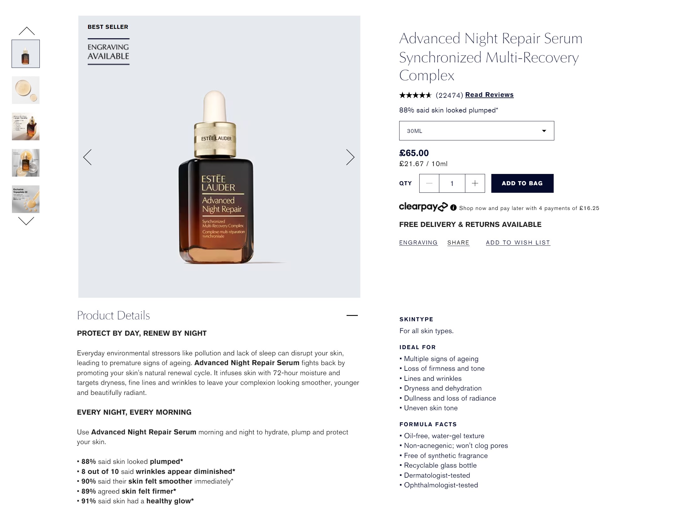
- Showcase if a Product is a Top Product: If a product is a bestseller or trending, showcase this status on the product page. Customers are drawn to popular items.
- Brand Block: Consider having a brand block in layout with a couple of compelling sentences about the brand on the product page, especially if it’s special but not well-known.
- FAQ: Adding a small block of frequently asked questions about the product and store can assist customers in their decision-making process.
- Social Proof and Endorsements: Highlight if the products you sell have been featured in media or endorsed by influencers on the product page.
- Awards: If the product or brand has won any awards, displaying this information can be valuable for building customer trust.
- Live Chat: Try out live chat if you have the resources. Be mindful that it shouldn’t interfere with mobile browsing and should be disabled on checkout pages.
- User Feedback: Employ tools such as Hotjar to inquire why users are exiting the product page without making a purchase. Importantly, implement this feedback mechanism for a limited period only; it’s not advisable to have it active for extended months.
- Social Media Share Icons: While becoming less critical due to widespread knowledge of how to copy and paste URLs, social media share icons can still be a valuable addition to your page.
- Tags: While not always necessary, as categories often suffice, some successful stores use tags to highlight specific features and display them on product pages.
- Wishlist: While I generally don’t recommend new online stores to offer customer to create an account, if you do decide to go that route, make sure to include a wishlist option which allows customers to save products they’re interested in for later purchase. Additionally, you can use the data collected from wishlists for email marketing or remarketing campaigns.
- Back in Stock Notifications: This feature allows customers to leave their email and receive notifications when an out-of-stock item is available again. WooCommerce Back In Stock Notifications and Shopify’s Back in Stock app are good examples.
- Discount Prices: Testing discounts or lower prices for products with high traffic but low conversion rates can be worthwhile. Messages indicating a “limited time offer” can increase effectiveness.
- Price Increases: Raising prices can sometimes imply higher quality, especially for items marketed as premium. For example, if you advertise your boots as high-quality and European-made, their price tag of €79 might not appear entirely convincing to potential customers. Anyways, wouldn’t it be nice to see if higher prices lead to more conversions?
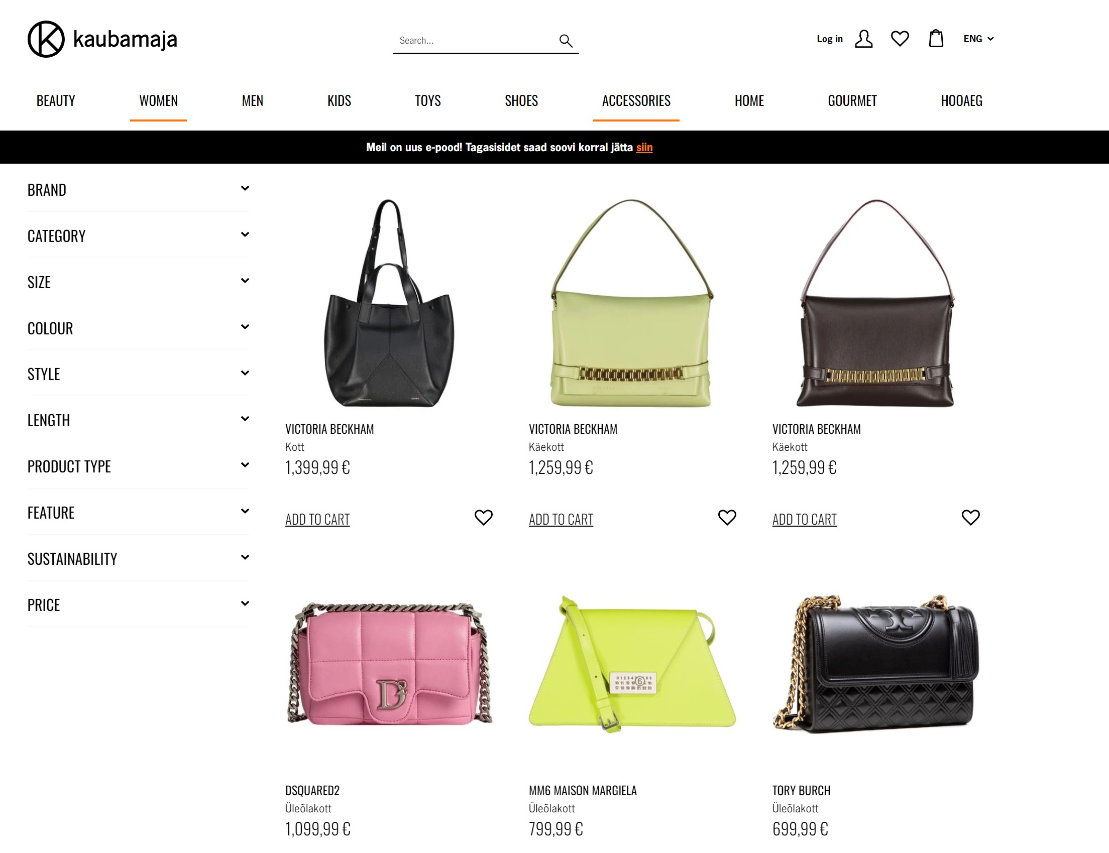
- Charm Pricing: Adjusting prices to end in ‘9’ can sometimes improve conversions.
- Price Match: While not recommended for new/small online stores, displaying a price match guarantee can aid in conversions, but ensure your store is really ready to match prices if customers find the same product cheaper elsewhere.
- Sticky Add to Cart Buttons: Increasingly common, sticky buttons may improve conversion rates. Experiment to see their effectiveness for your store.
- Viewer Count: Displaying how many people are viewing a product might be worth trying.
- Bundle Offers: Shopify stores leveraging bundle offers on product pages can see improved conversion rates and higher order values.
- Popups with Offers: Timely popups offering discounts or free shipping can capture interest, especially when triggered by user behavior on the product page. E.g trigger an offer when user has been on the page for 2 minutes or multiple times or is exiting from the page.
- Trust Icons: Customers often find trust icons reassuring, even if they may not consciously realize it. Therefore, consider incorporating payment icons etc onto your product pages, or ensure they are prominently displayed in your footer for easy access across the entire store.
All things considered, don’t forget that the goal of a product page is to encourage a person to make a purchase. Therefore, avoid overwhelming users with excessive widgets and information pop-ups. Also, ensure that your product page doesn’t become too slow. Make changes, test them, and monitor whether the results improve. And remember, no product page will convert if the product you’re selling is of poor quality, or if the overall website lacks trustworthiness, or if the checkout process is problematic.
Leave a Reply
You must be logged in to post a comment.